Blenz Coffee
A solution to improve customer retention for Blenz Coffee, and a comprehensive exploration of the Blenz app's design, initiated through collaboration between our team and Blenz. The process involved a meticulous design evaluation and subsequent modifications based on insights derived from user research tests and the assessment of various solutions.
Click here and test it out!
In collaboration with Blenz Coffee, our team redesigned the brand’s mobile app to address issues with user engagement and retention. The original app, launched quickly in response to a 30% drop in sales during the COVID-19 pandemic, prioritized basic functionality but lacked usability, aesthetic polish, and customer-centric design. Our goal was to transform the app into an intuitive and appealing digital experience that aligned with customer expectations and Blenz’s brand values.
Overview

Research
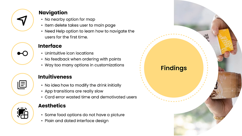
We began with stakeholder interviews with Blenz management to understand the core business and user problems. The key issue was clear: the hastily released app failed to meet usability standards, lacked testing, and didn’t retain users. To supplement this, we interviewed users familiar with competing coffee apps and conducted usability walkthroughs using the original Blenz app.
Key findings from user interviews:
-
Poor navigation: Users struggled to find core features easily.
-
Complex ordering flow: The ordering process was unclear and fragmented.
-
Uninspiring visuals: A dated and unrefined interface reduced user interest and trust.

To validate these concerns, we conducted structured usability tests and heuristic evaluations. Our key insights included:
-
Information architecture issues: An overwhelming number of menu items without a clear hierarchy confused users.
-
Low visibility of system status: Users weren’t sure where they were in the order flow due to a lack of feedback and visual cues.
-
Quantified usability concerns: A design team evaluation yielded a 0.97 agreement score, confirming high consistency in identified issues.
Issues
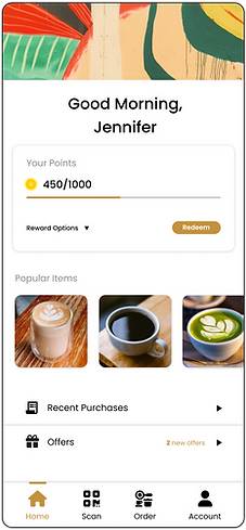
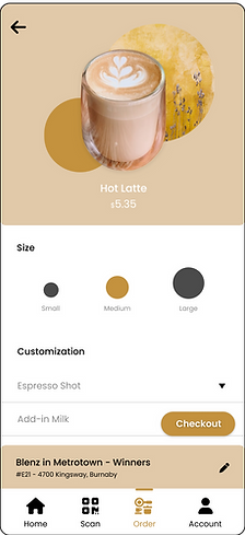
We mapped the user journey across four critical app stages:
-
Home – Launch point and hub for discovery
-
Location – Store selection based on proximity
-
Customization – Product selection and personalization
-
Checkout – Payment, confirmation, and loyalty tracking
This structure allowed us to isolate usability problems and systematically redesign the experience around real user needs.
User Flow


Using Figma, we developed mid- to high-fidelity wireframes focused on a streamlined ordering process and modernized UI. Key enhancements included:
-
UI Redesign: A visually refreshed interface with updated color schemes and layout for improved clarity and appeal.
-
Loyalty Integration: A points-based system to incentivize regular purchases and improve retention.
-
Onboarding Experience: A simple walkthrough to help first-time users quickly understand the app’s functionality.
Prototype


Participants provided insights on overall satisfaction and ease of use during and after interacting with both versions. Observations, post-test questionnaires, and metrics such as task success rates and time-on-task were employed to measure user experience. The comparative analysis of navigation, feedback, and satisfaction levels informed the conclusion that our prototype demonstrated improved usability and user-friendliness compared to the existing Blenz app. Throughout the project, I was involved with conducting user-research and collecting data results by way of queued debrief recall and pre/ post-test questionnaires. I was then tasked with implementing the solutions that we came to, into the Figma wireframe of our prototype, and deck design for our final presentation. The main skills I learned from this project were primarily that of technical design skills, an increased proficiency with using Figma, and lastly, I built a strong foundation in design research techniques that are a standard of the design process.