AFCA-BC
An ongoing website redesign and web design relationship with a real professional organization, from a first coherent visual direction through continued stewardship of the live site today.
Context
AFCA-BC (the Association of Filipino-Canadian Accountants, BC chapter) is a real, active non-profit for Filipino-Canadian accounting professionals in Vancouver. It runs on the kind of programming a membership organization actually needs to keep running: professional development seminars, tax-clinic volunteering, an annual general meeting, ongoing council meetings, and social events for members and their families.
I was brought on in May 2024 to redesign the organization’s website, and I’ve continued working with AFCA-BC since: stakeholder interviews and board-member feedback sessions, an initial redesign, and the ongoing updates a live organizational site actually needs.
The existing site
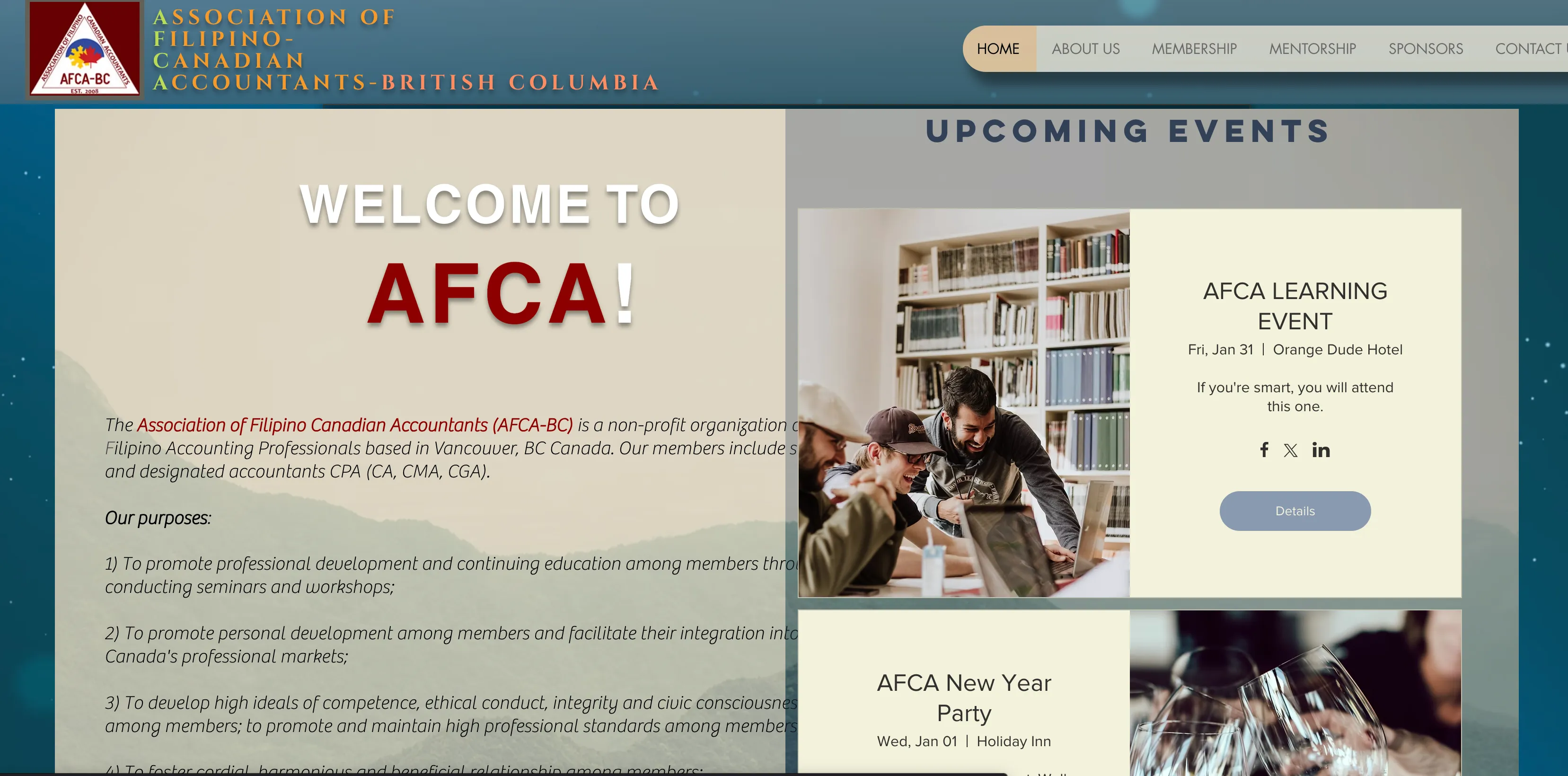
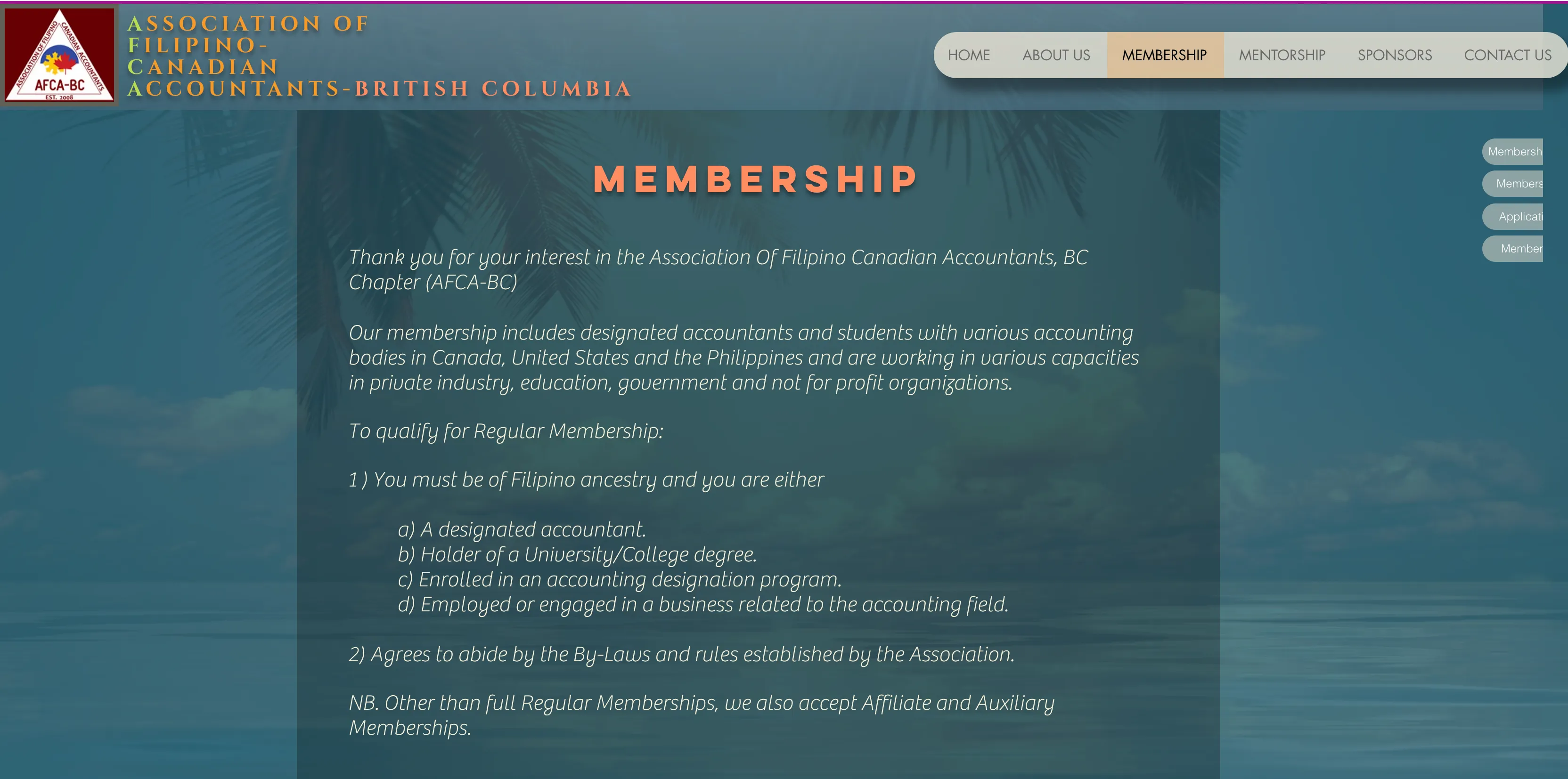
Before any redesign work, the site itself was the clearest evidence of the problem: several different visual languages competing on the same domain, a blue-gray hero here, a solid maroon band there, orange-and-yellow-green title lettering, coral-and-maroon two-tone blocks, a tan contact panel, with no single system tying it together.
Investigation
Before redesigning anything, I audited the live site page by page and wrote up what I found: a real, dated document, not a retrospective summary.
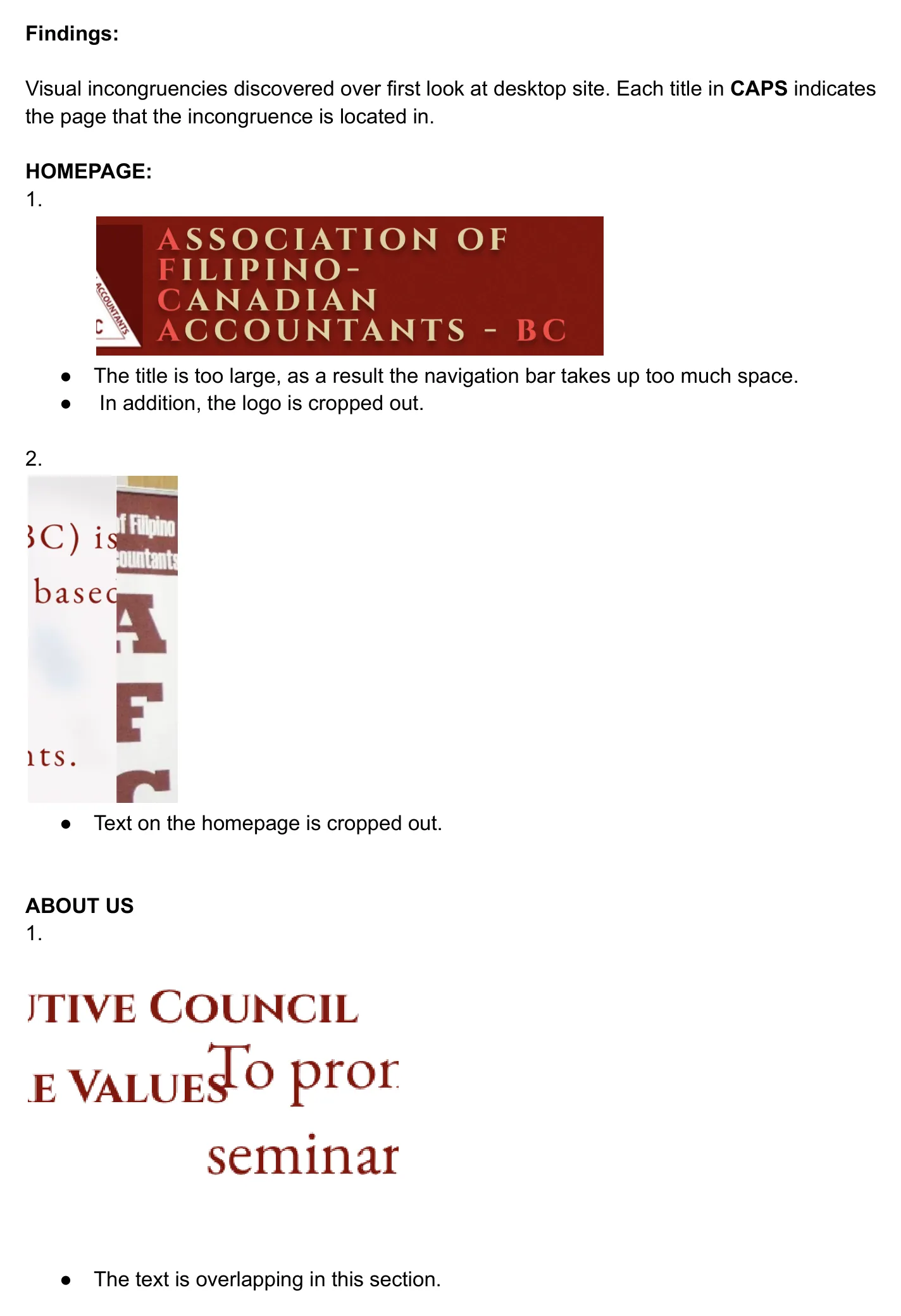
Homepage
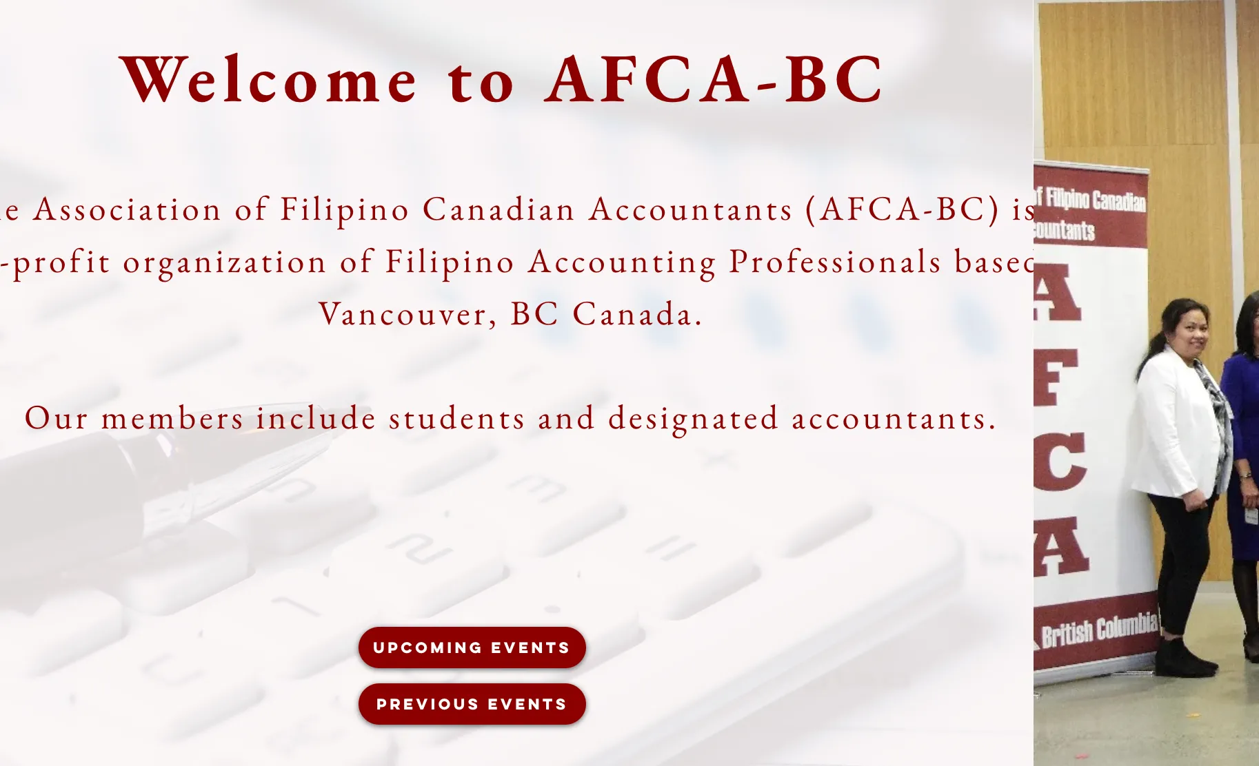
- The title is too large, as a result the navigation bar takes up too much space.
- The logo is cropped out.
- Text on the homepage is cropped out.
About Us
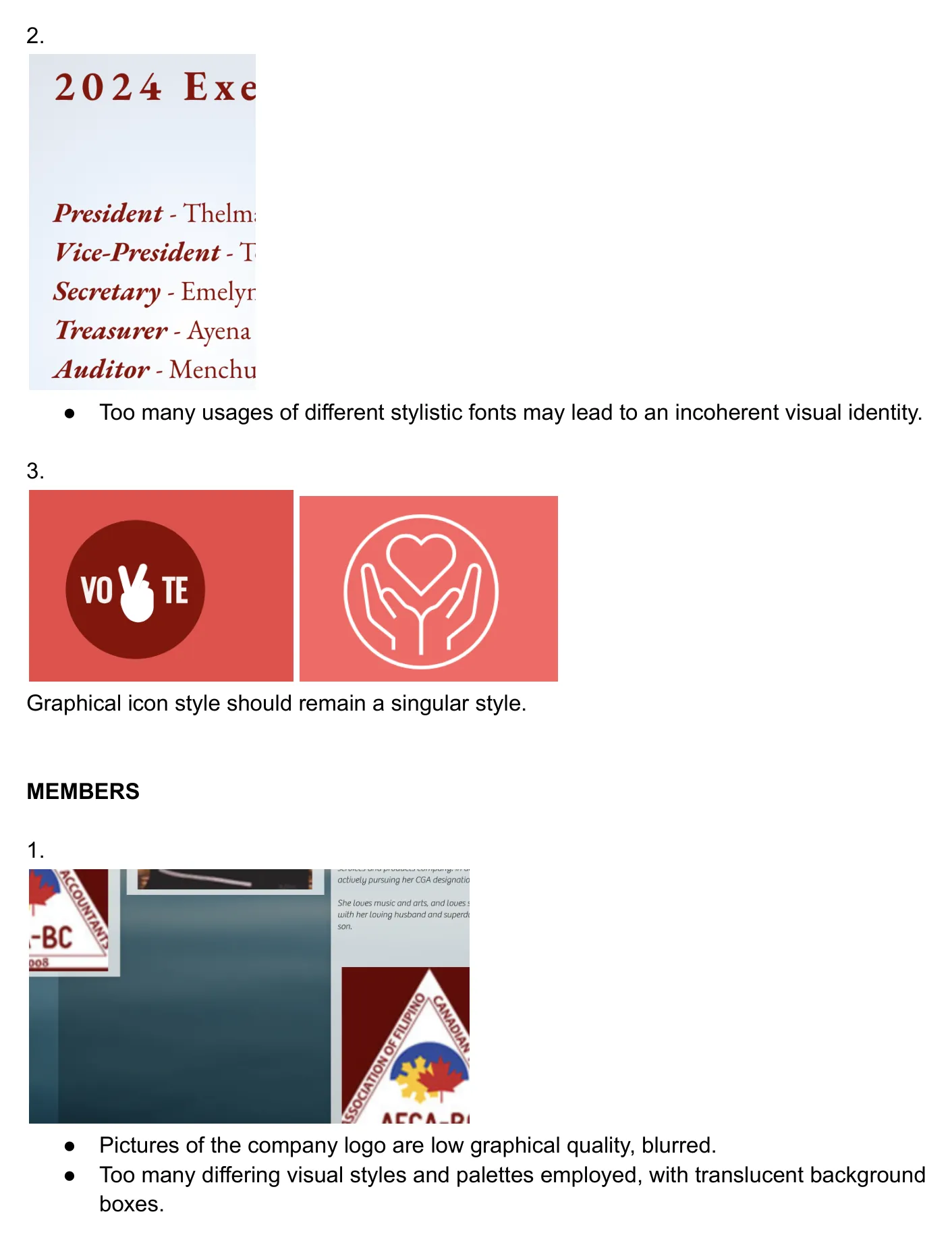
- The text is overlapping in this section.
- Too many usages of different stylistic fonts may lead to an incoherent visual identity.
- Graphical icon style should remain a singular style.
Members
- Pictures of the company logo are low graphical quality, blurred.
- Too many differing visual styles and palettes employed, with translucent background boxes.
Contact Us
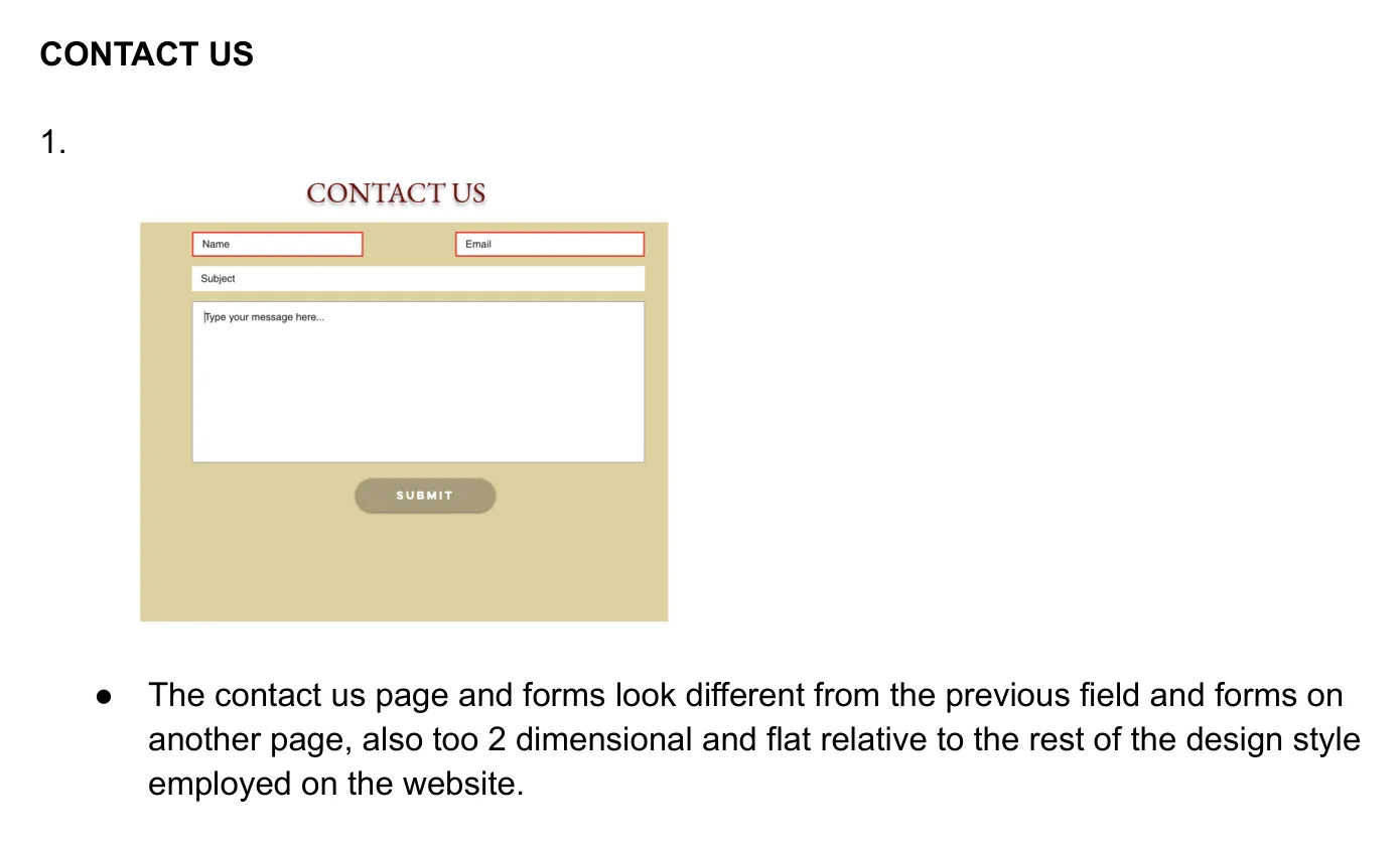
- The contact us page and forms look different from the previous field and forms on another page, also too 2-dimensional and flat relative to the rest of the design style employed on the website.
The first iteration
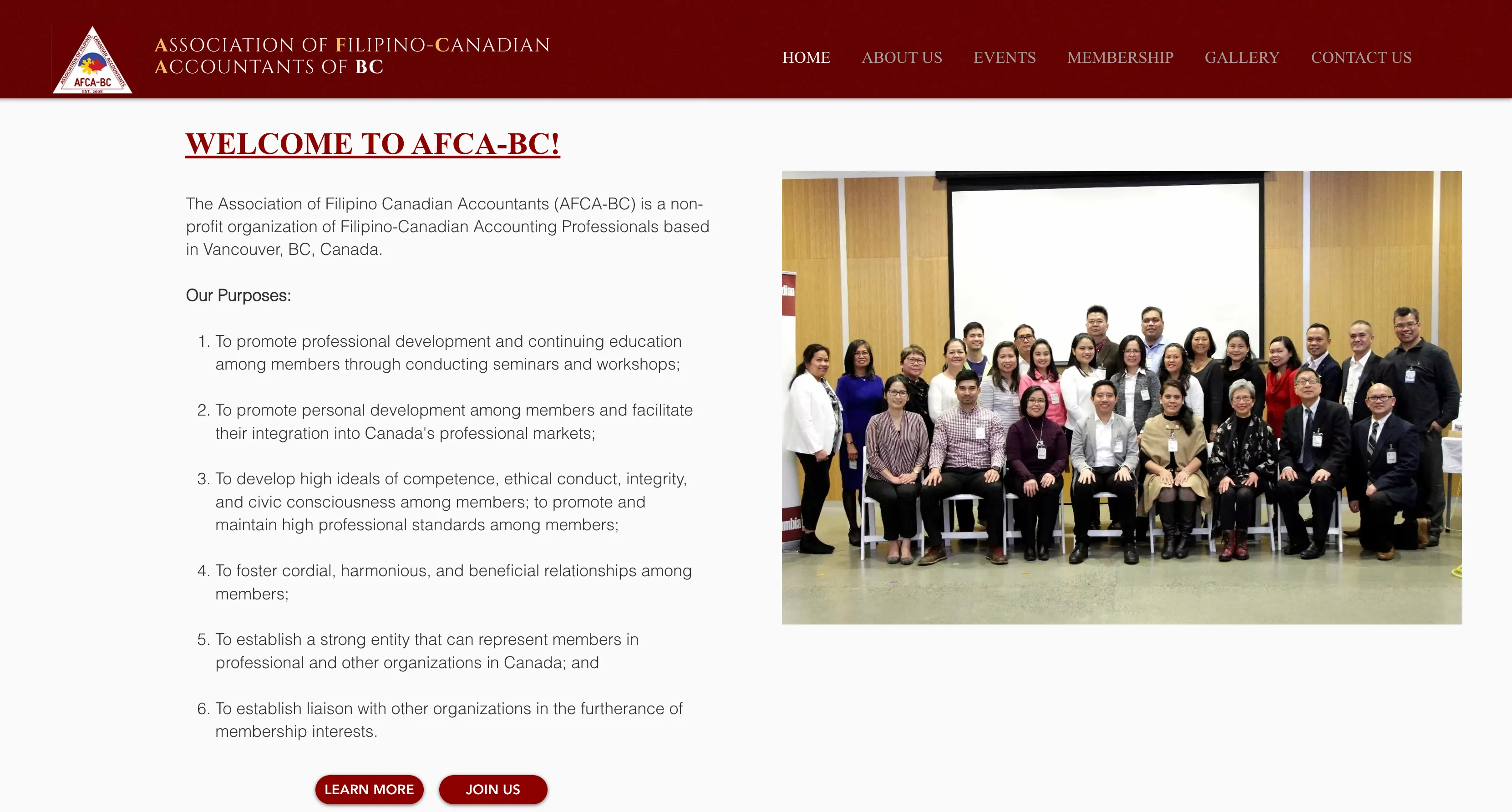
Within days of that audit, an early redesign direction started to take shape. It’s the first appearance of what would become the current site’s visual language: red and white, a serif headline, and a single coherent hierarchy in place of the old mix of styles.
Old site
First iteration
Current site
Building a coherent system
The AFCA-BC mark itself (the triangular badge logo) predates this project and hasn’t changed. What changed is everything around it: one consistent red, a single editorial serif for headings paired with clean sans-serif body text, and a layout hierarchy that replaced the old site’s competing styles.

Information architecture
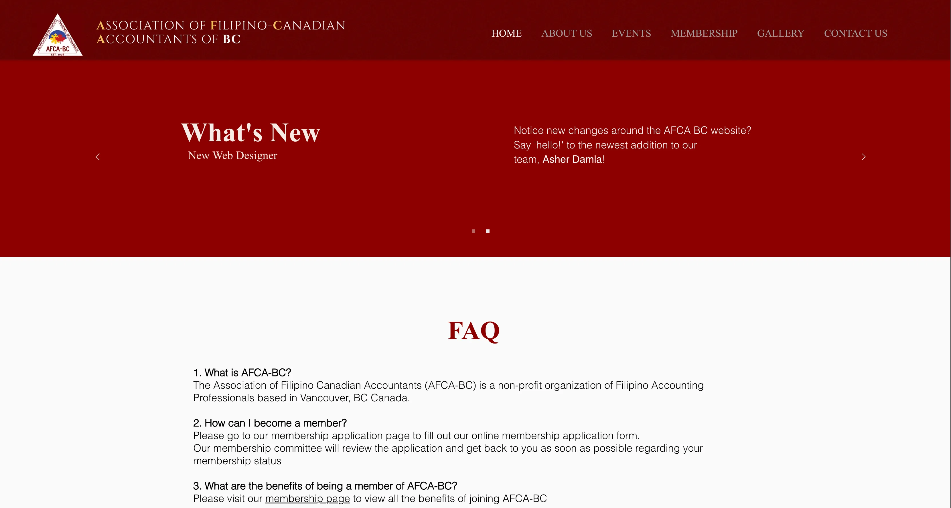
The old top-level navigation was Home, About Us, Membership, Mentorship, Sponsors, and Contact Us. The current navigation is Home, About Us, Events, Membership, Gallery, and Contact Us. Events and Gallery are now present as their own destinations; Mentorship and Sponsors are no longer top-level items.
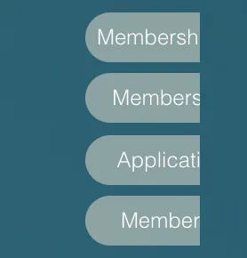
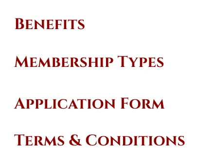
The clearest, most direct structural fix is inside the Membership section itself. The old sub-navigation existed but was unusable: its own container cut the labels off. The current structure is the same set of ideas, fully legible:
Old membership navigation
Current membership navigation
The site today
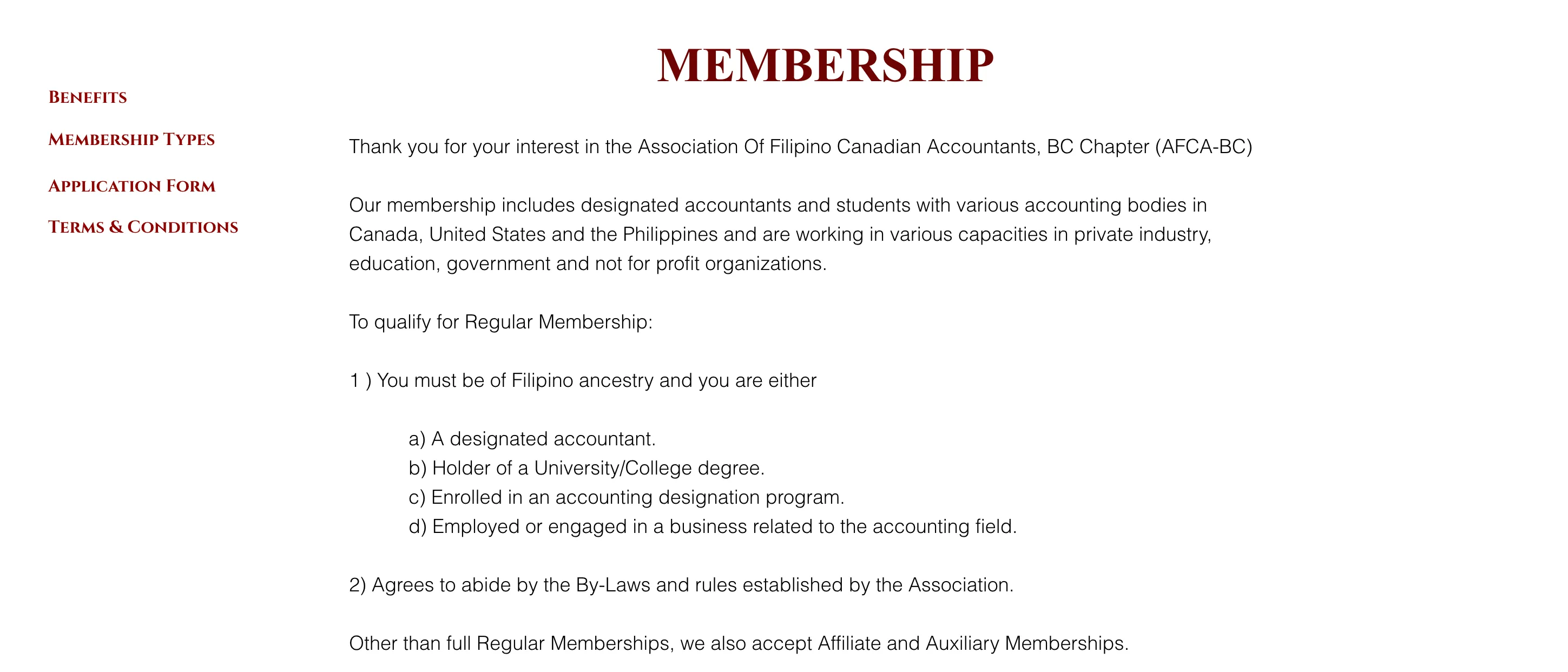
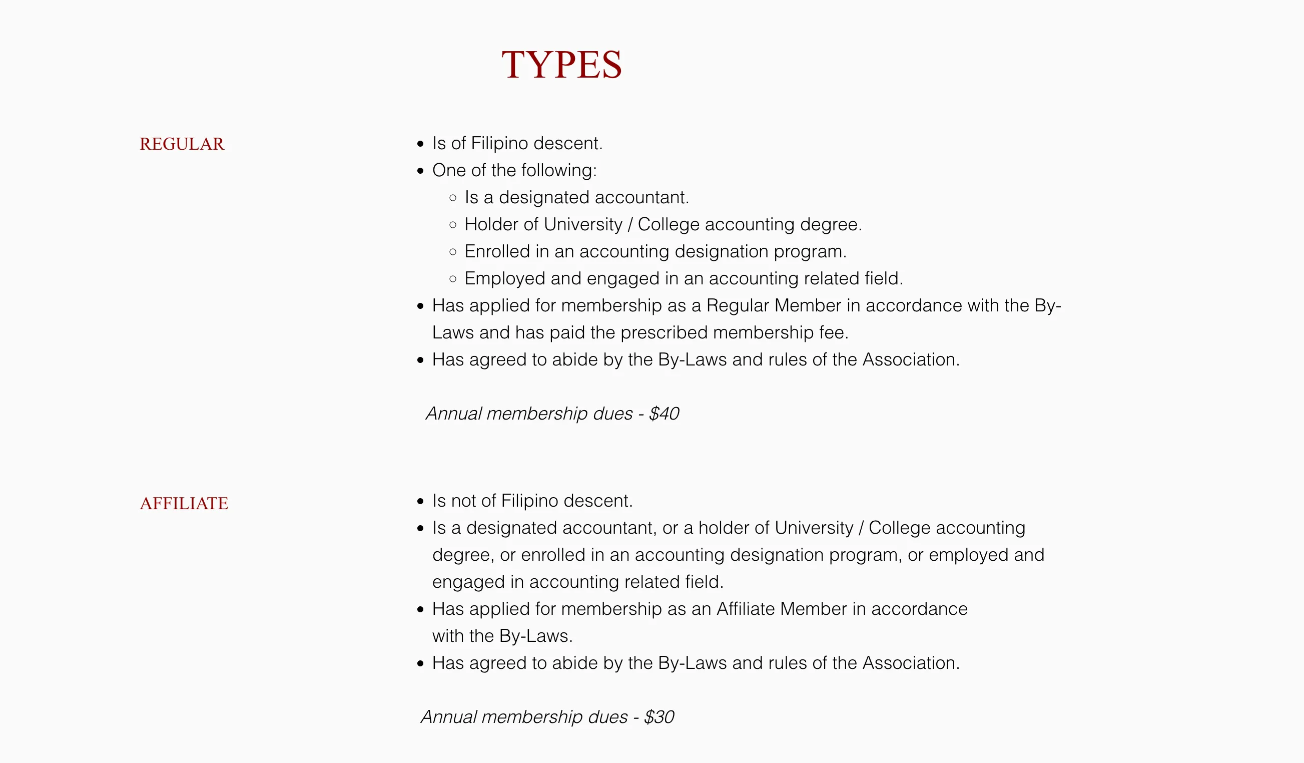
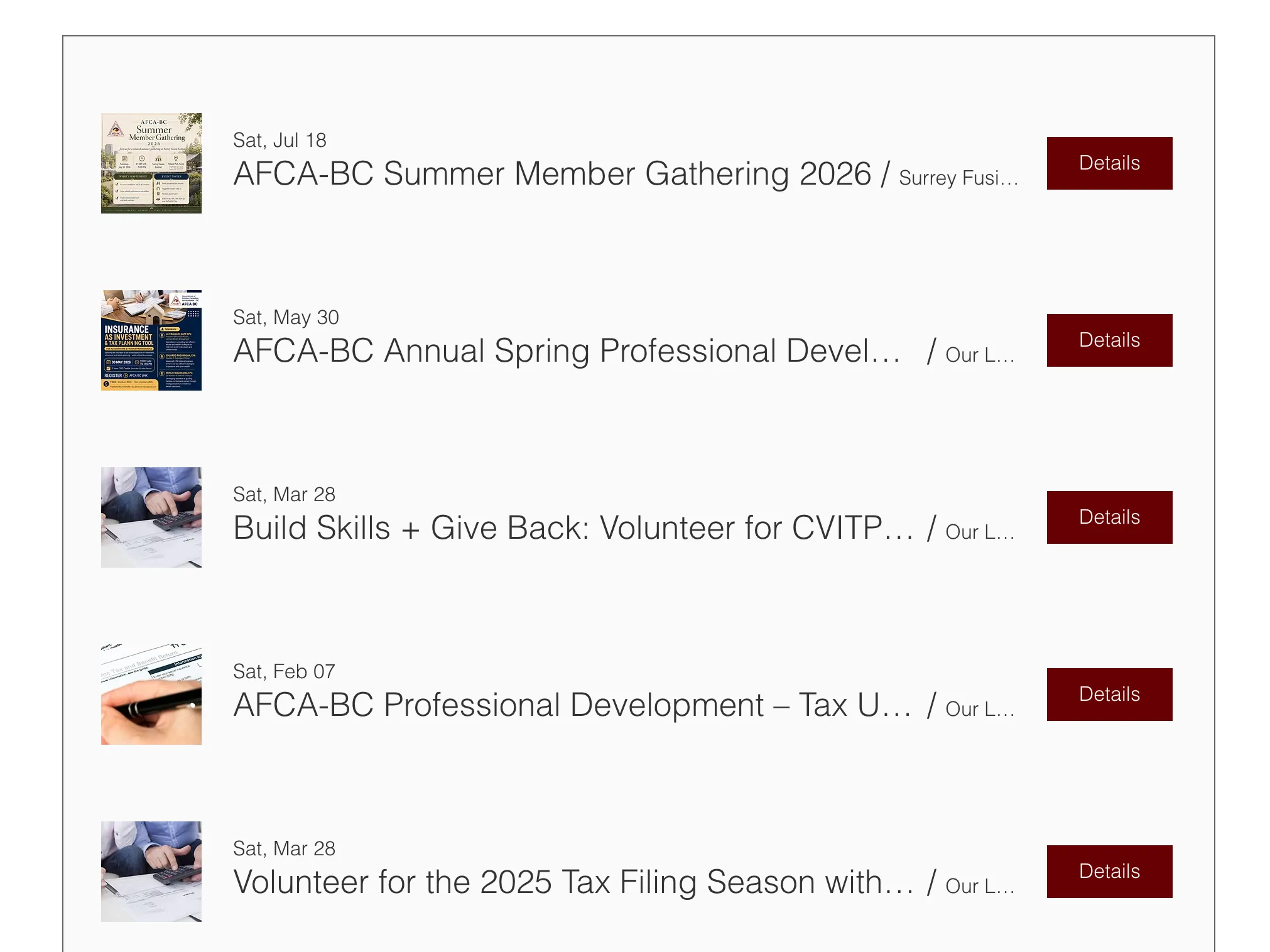
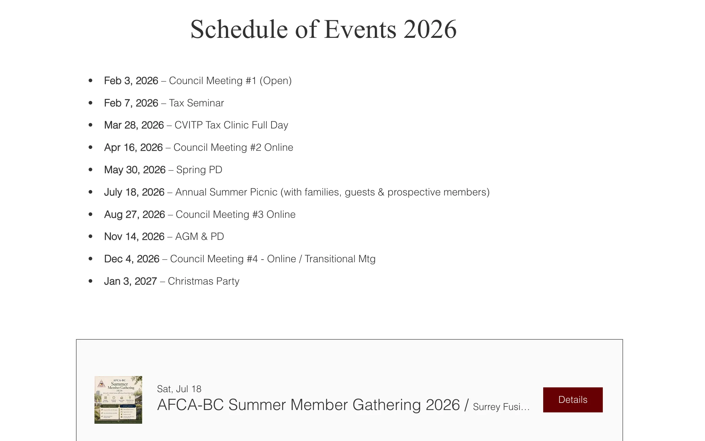
The site now includes several content structures the old evidence doesn’t show: a fuller membership section, dedicated event discovery, and ongoing organizational updates.

Ongoing stewardship
This was never a single delivery. Since the initial redesign, I’ve kept working with AFCA-BC: responding to requests, keeping content current, and maintaining the site as the organization’s needs change.
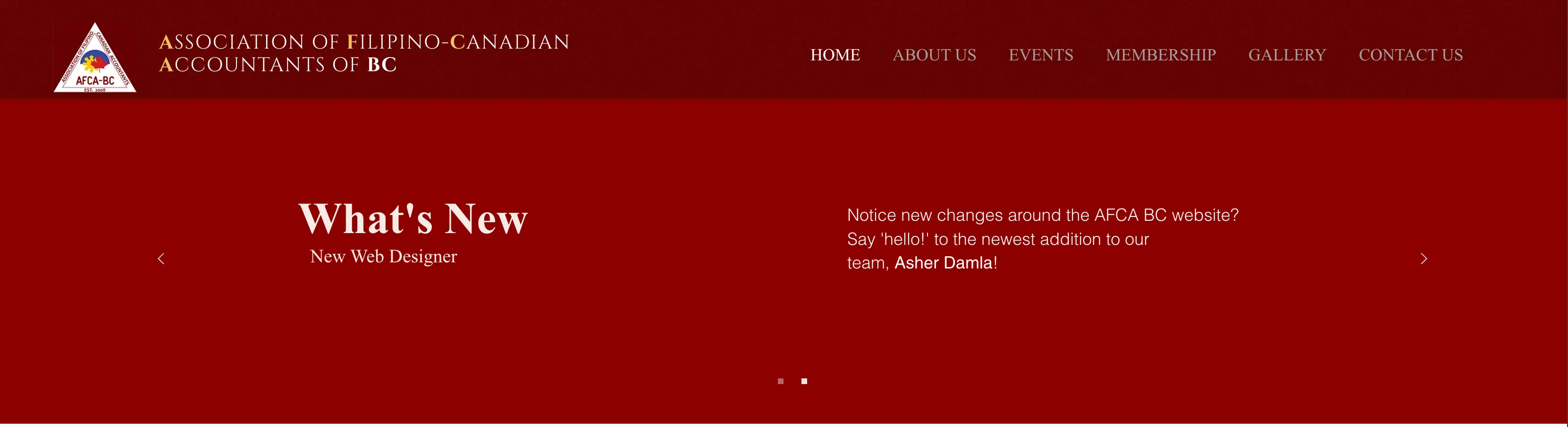
The site still names me as its web designer. That’s the clearest evidence this has stayed a working relationship, not a one-time project.
My role on this project
- Stakeholder interviews and user research to identify pain points and content gaps
- Multiple design iterations in Figma, developed through feedback sessions with board members
- Reorganizing the site's information architecture
- Ongoing content management and iterative updates based on the organization's needs
Reflection
Working with AFCA-BC has been different from a self-contained project with a clear finish line: it’s a real organization whose needs keep changing, and the website has to change with them. That’s meant designing within an existing system rather than building one from scratch, and treating the relationship itself, not just the initial redesign, as the actual deliverable.