Blenz Coffee
A team redesign of Blenz Coffee's mobile ordering app, addressing the usability problems left by its rushed, COVID-era launch.
The problem
Blenz Coffee’s mobile app was launched quickly in response to a drop in sales during the COVID-19 pandemic. It shipped with basic ordering functionality, but little attention to usability, visual polish, or how customers actually wanted to interact with it.
30%
Drop in sales that pushed Blenz to bring this app to market quickly. The starting point for this project, not an outcome of it.
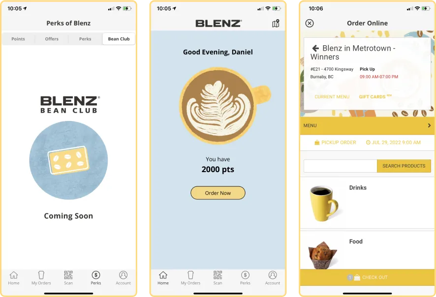
Our team’s job was to turn that rushed release into an app that matched what customers expected from a modern coffee-ordering experience, and from Blenz’s own brand.
Research
We approached the redesign through three research threads:
- Stakeholder interviews with Blenz management, to understand the business problem behind the rushed launch
- Interviews with users of competing coffee-ordering apps, for comparison
- Usability walkthroughs of the original Blenz app itself, watching where people got stuck
Findings & evaluation
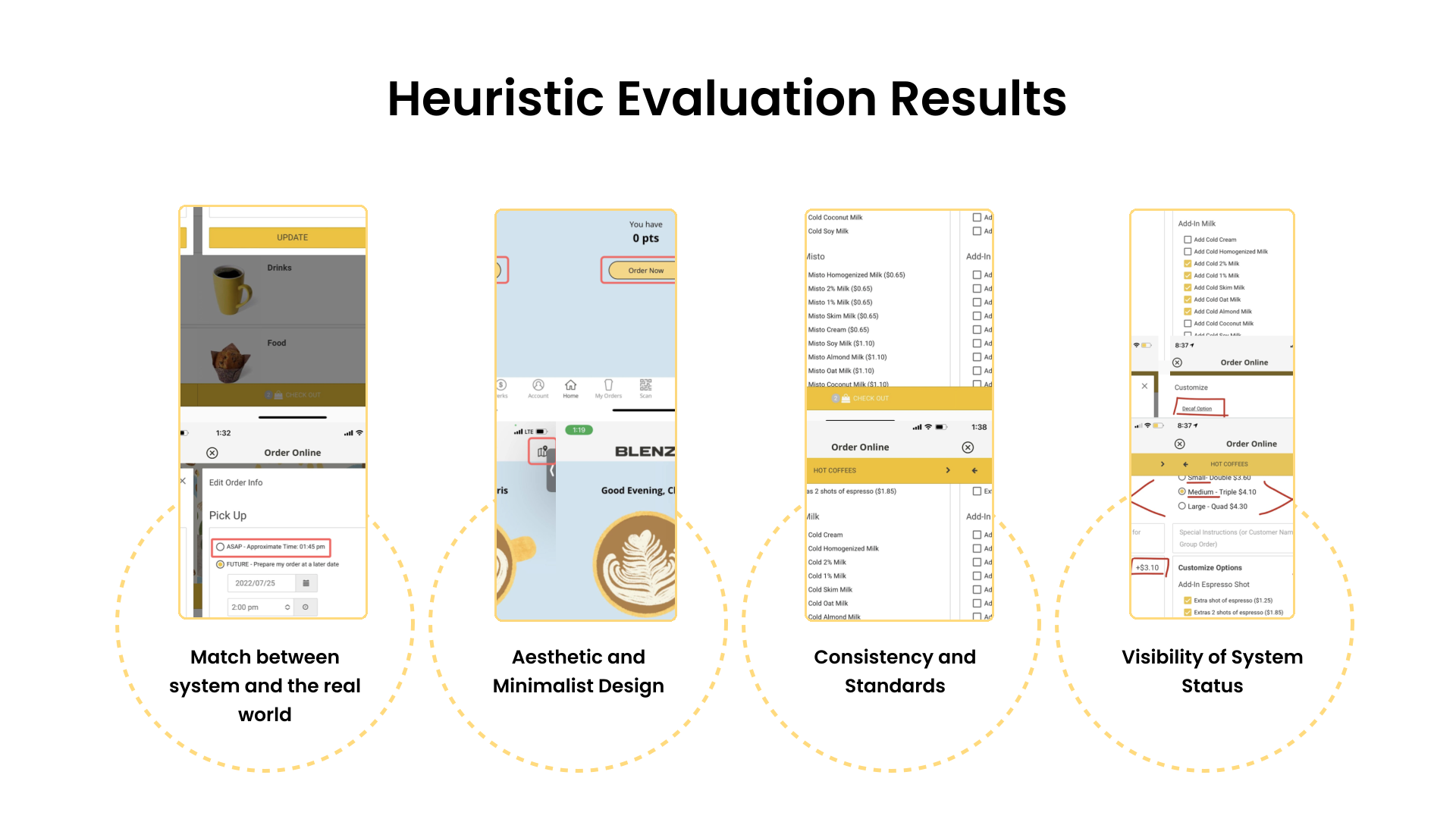
Two rounds of evaluation shaped what we prioritized: a heuristic evaluation the team ran against standard usability heuristics, and a broader usability pass covering navigation, interface, intuitiveness, and aesthetics.
Match Between System & the Real World
- The order flow used the acronym "ASAP" rather than a plainer, more familiar "Order Now."
Aesthetic & Minimalist Design
- Too many options on screen at once, which could distract users.
Consistency & Standards
- The map icon led to a different version of the location than the "Order Now" button, even though both routed to the same ordering page.
Visibility of System Status
- No running total was shown for an order, only the incremental cost of add-ons.
0.97
Agreement score from the team’s heuristic evaluation: how consistently team members independently flagged the same usability problems when assessing the original app against standard heuristics.
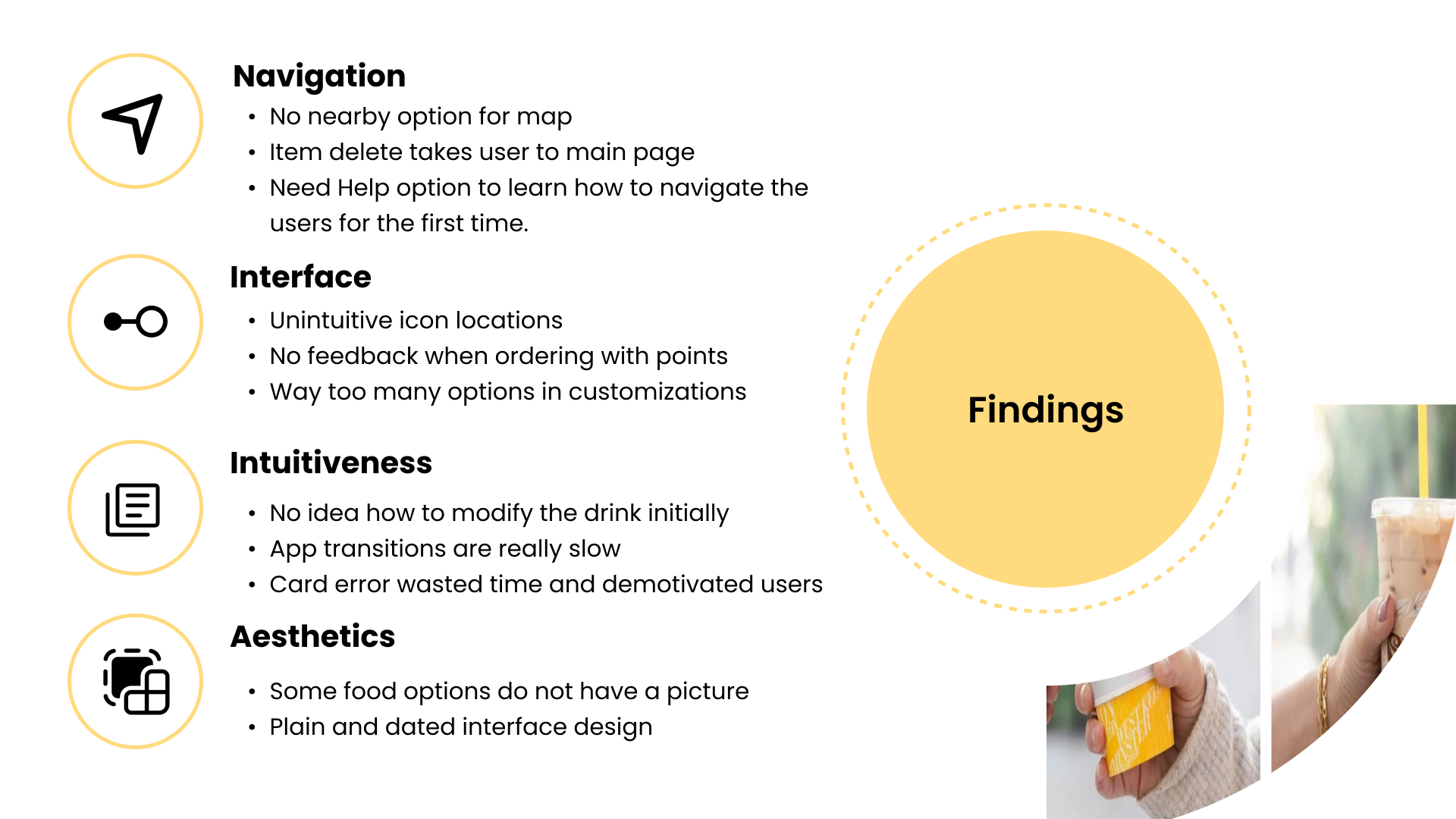
A separate usability pass, drawn from interviews and walkthroughs of the original app, grouped further issues by category:
Navigation
- No "nearby" option for the map
- Deleting an item returned users to the main page
- No onboarding or help option for first-time users
Interface
- Unintuitive icon placement
- No feedback shown when ordering with points
- Too many options inside customization
Intuitiveness
- Unclear how to modify a drink at first
- App transitions were slow
- A card error wasted time and discouraged users mid-order
Aesthetics
- Some food items had no photo
- Interface read as plain and dated
My role on this team project
- Conducted user research and usability walkthroughs alongside the team
- Collected data through debrief recall and pre/post-test questionnaires
- Implemented the team's agreed solutions into the Figma prototype
- Designed the final presentation deck
User journey
Home → Location → Customization → Checkout
We mapped the redesign around four stages of the ordering journey. The checkout step and the customization step share a single screen in the prototype. There’s no separate order-confirmation screen among the project files.
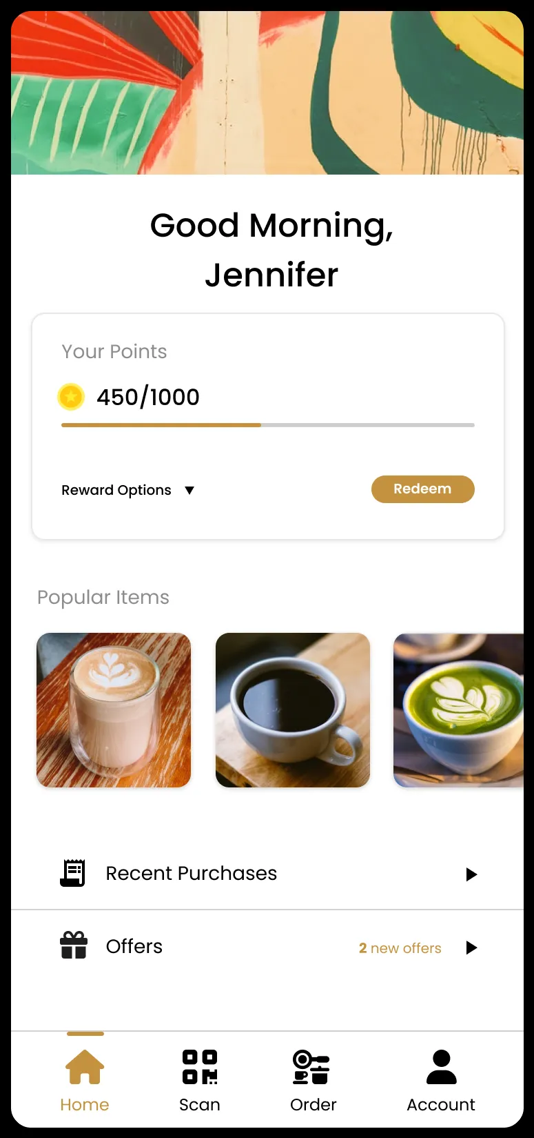
Home
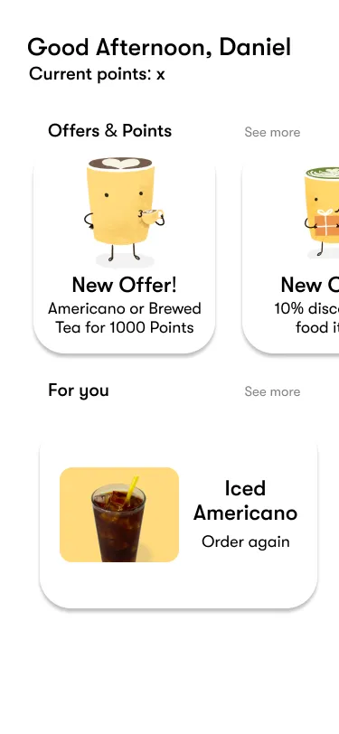
Points balance, popular items, and quick access to ordering.
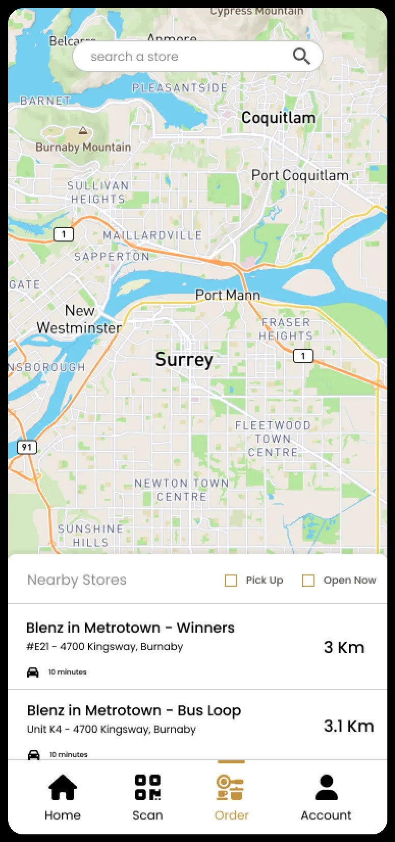
Location
Store search and nearby pickup locations.
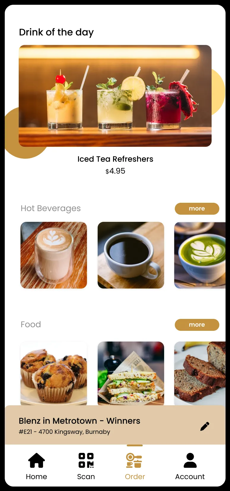
Customization
Browsing the menu: drink of the day, hot beverages, and food.
Checkout
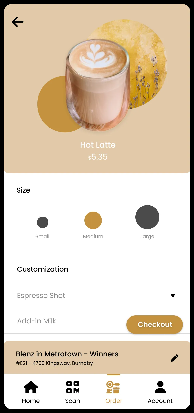
Size, add-ins, and price, with checkout on the same screen.
This screen also handles item personalization: the prototype does not include a separate checkout-confirmation screen.
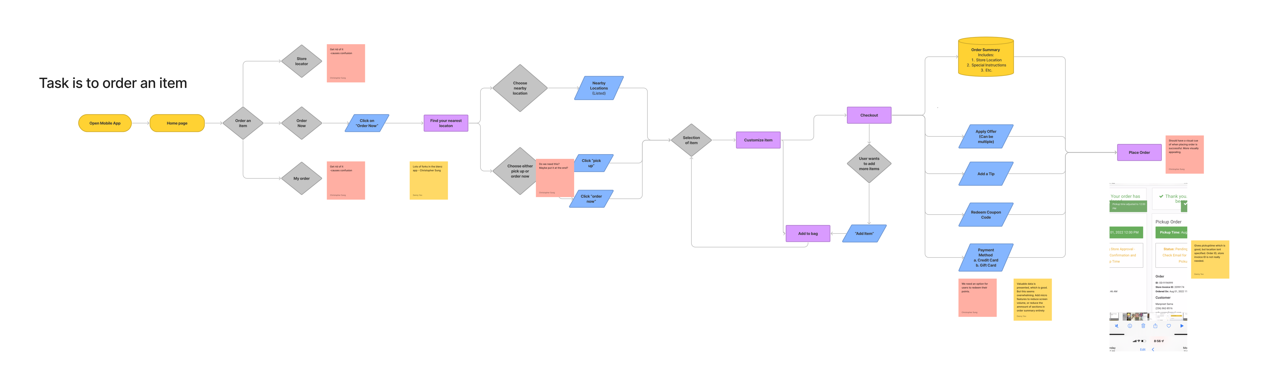
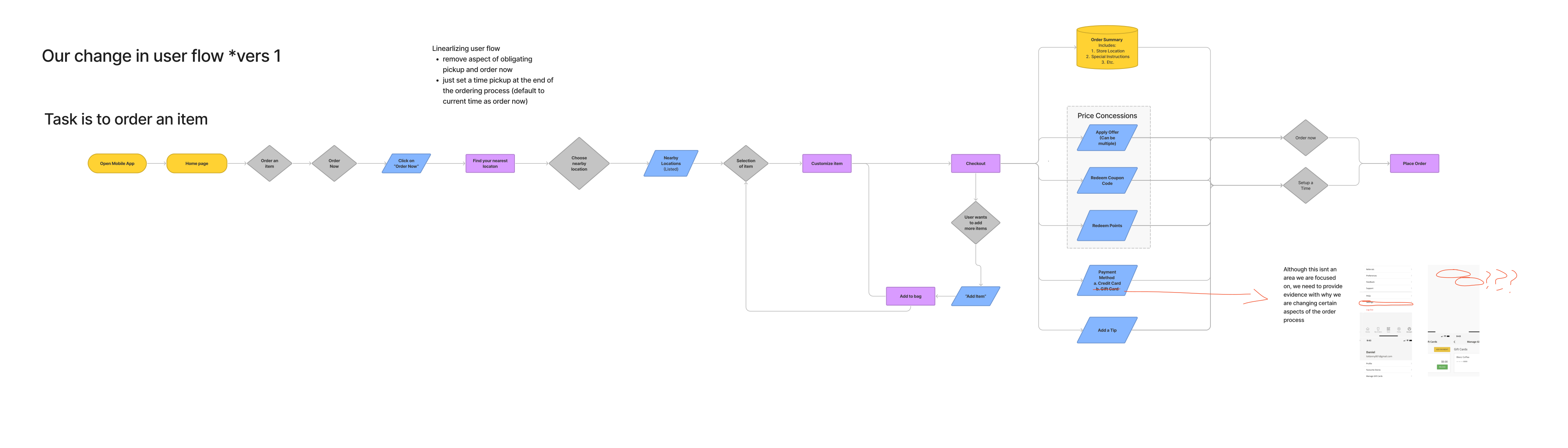
Mapping the flow
Before the four screens above existed, we mapped the full ordering flow end-to-end, then revised it once. The team’s own notes on the revised diagram describe linearizing the flow: removing an upfront choice between “pickup” and “order now,” and instead setting pickup time at the end of the process.
Design response
Three changes carried the redesign, responding directly to the findings above:
- UI redesign: an updated colour palette, layout, and typography, responding to the “plain and dated interface” and “aesthetic and minimalist design” findings.
- Loyalty integration: a points balance and redeemable rewards, visible on the Home screen above, to give customers a reason to return.
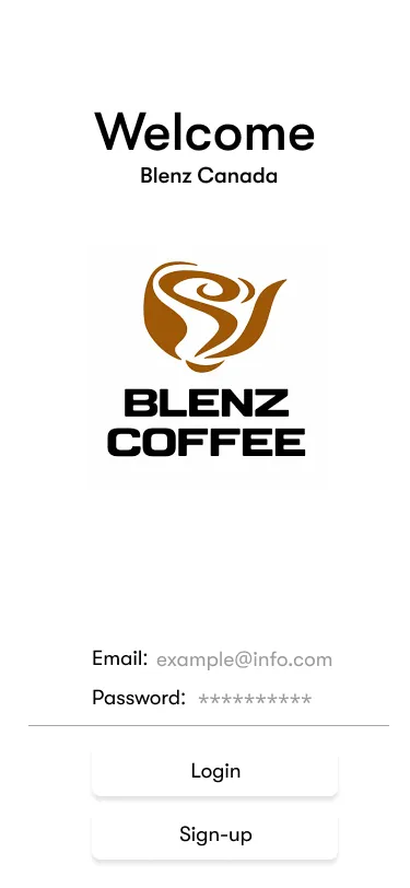
- Onboarding experience: a simple first-run walkthrough for new users, responding to the original app’s missing help option for first-time users.
Testing & validation
We had participants use both the original app and the redesigned prototype, then compared them on navigation, system feedback, and satisfaction. Those were the same three areas our earlier heuristic and usability evaluations had flagged as weak. Task success rate, time-on-task, and pre/post-test questionnaires were how we measured it. The redesign came out ahead on all three; we didn’t carry exact figures forward from the coursework, but the direction was consistent across every participant.
Prototype
Reflection
The clearest habit Blenz left me with was tracing each design decision back to a specific finding rather than a general sense that the app needed to improve: linearizing the ordering flow so pickup time moved to the end instead of gating the start, or building the onboarding walkthrough directly in response to first-time users having no help option. Being able to point at a screen and name the finding behind it is what I took most from this project, alongside a stronger command of Figma and a foundation in design research techniques (debrief recall, pre/post questionnaires) that are now standard tools in how I work.