Personal & Organizational

Fresh Slice

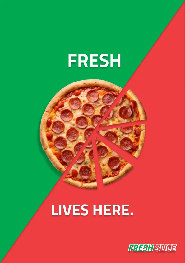
A promotional design project for Fresh Slice Pizza, translating one visual system across social, print, web, and large-format applications.
Role
Graphic Designer
Timeline
March 2026
Tools
Figma
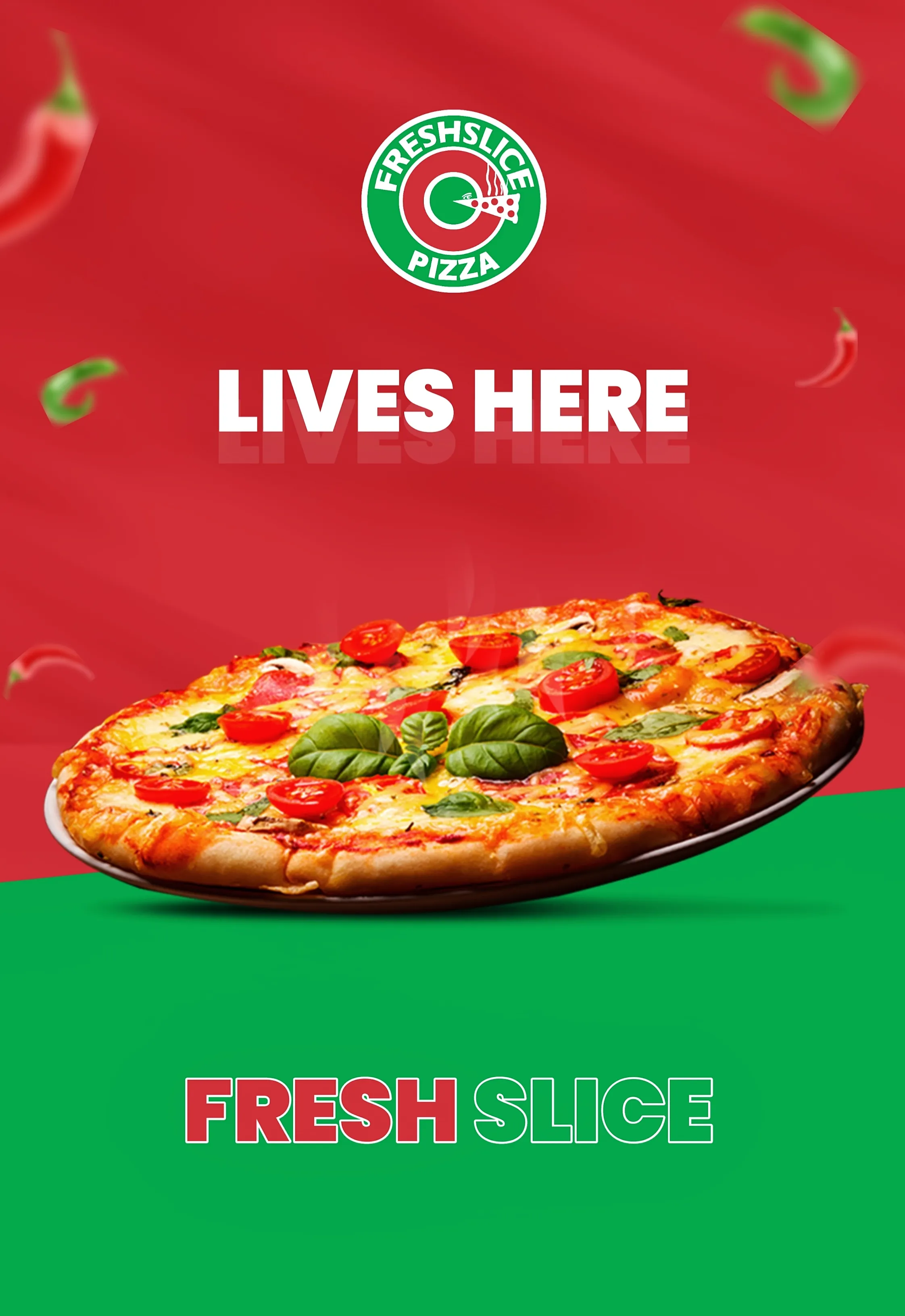
A large-format 'Fresh Slice Lives Here' poster in green, red, and white, featuring the Freshslice Pizza logo and bold outlined-and-filled lettering.
The campaign's central visual statement, applied to a large-format poster.

A promotional design project for Fresh Slice Pizza, exploring a cohesive visual system across digital and print applications.
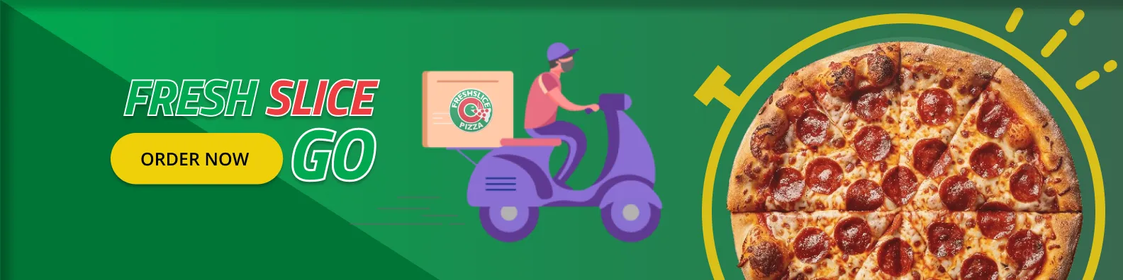
A wide 'Fresh Slice GO' delivery banner illustration, showing a delivery-scooter graphic alongside a pizza photograph and the Freshslice logo.
Web banner — the same system adapted to a widescreen format.
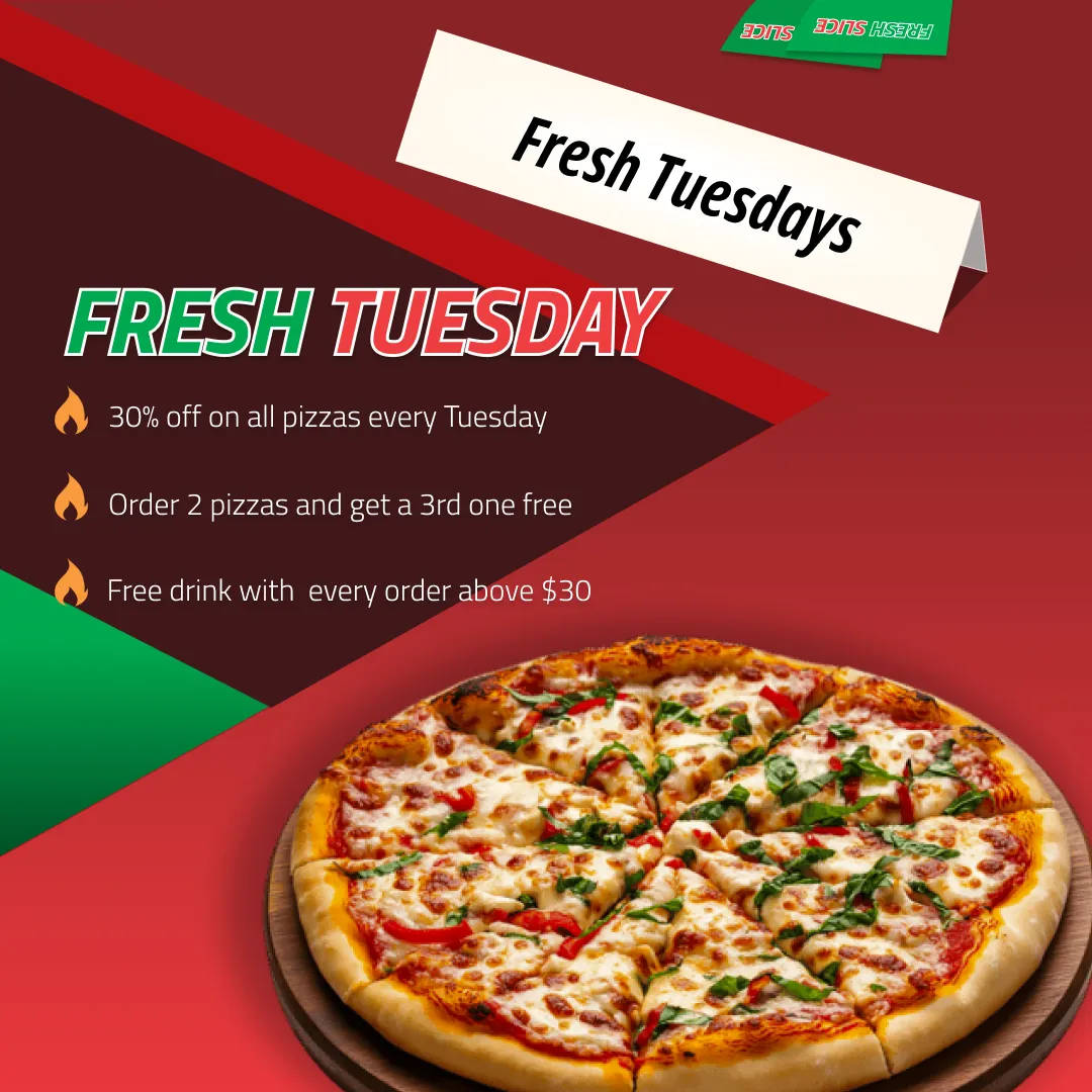
A square Instagram promotional post reading 'Fresh Tuesday, 30% off,' with a photograph of a fresh pizza.
Instagram post.
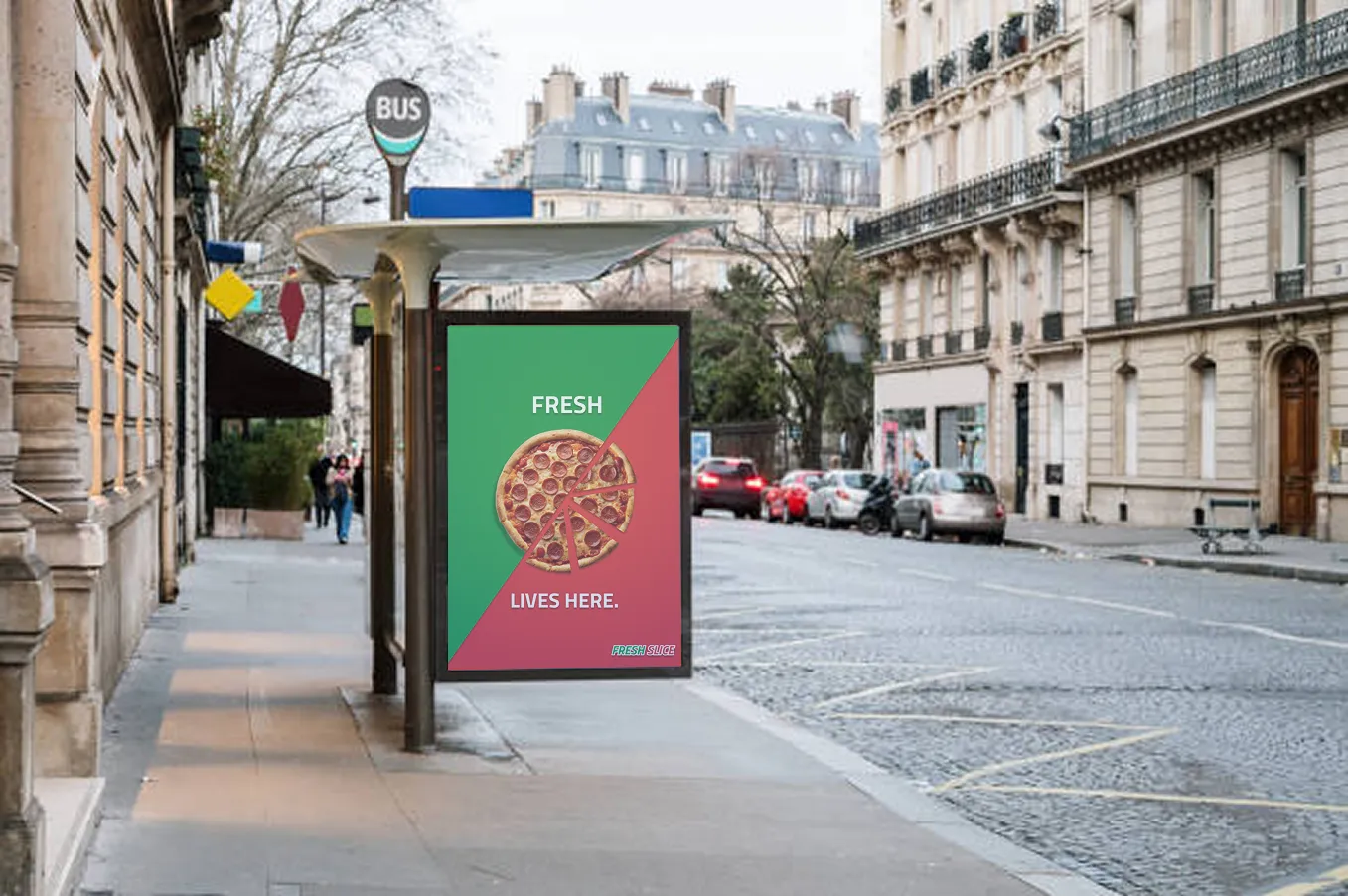
A bus-stop advertisement mockup showing the 'Lives Here' poster composited into a street-side ad panel.
Bus-stop mockup — the poster applied to an out-of-home format.
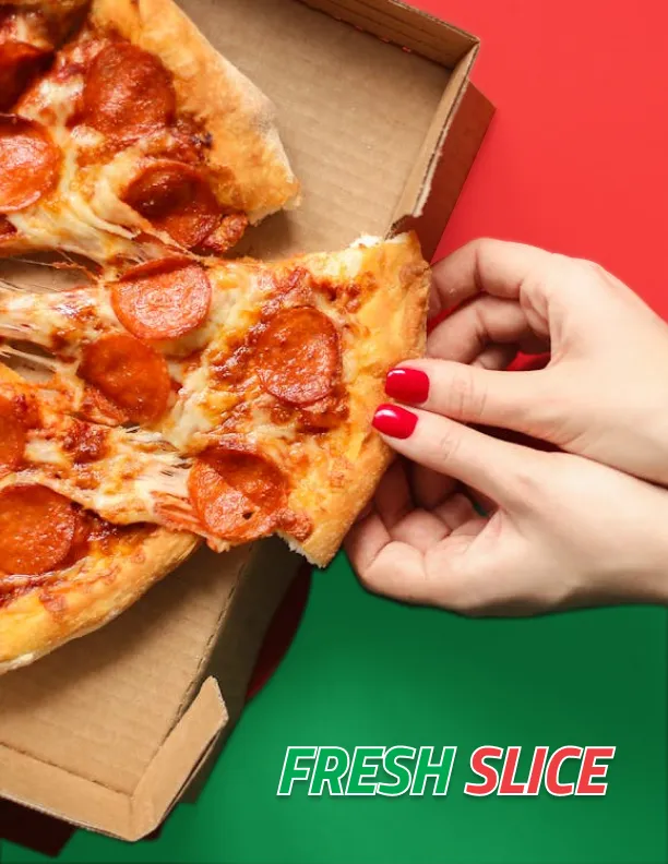
A letter-size flyer pairing a close-up photograph of a hand holding a pizza slice with an outlined 'Fresh Slice' wordmark.
Print flyer.
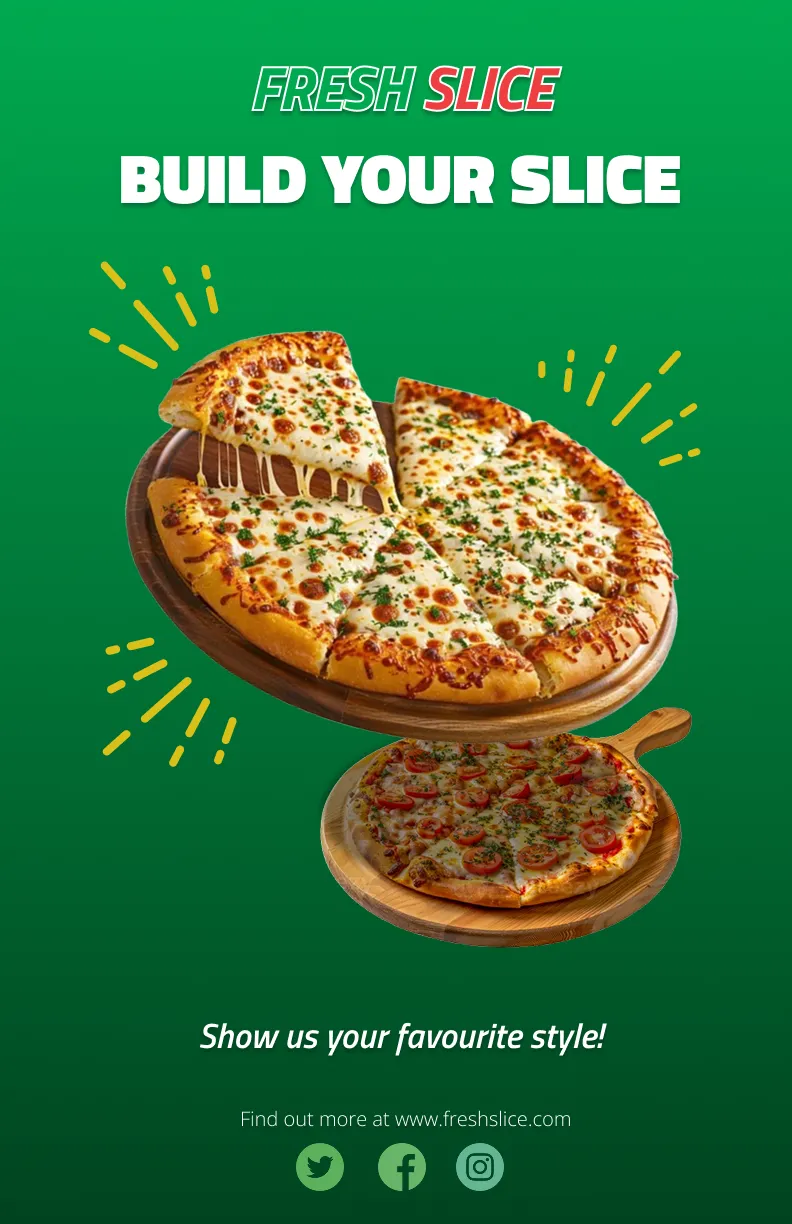
A tabloid-size 'Build Your Slice' poster featuring two pizza photographs, social-media icons, and the Freshslice website address.
Tabloid poster.
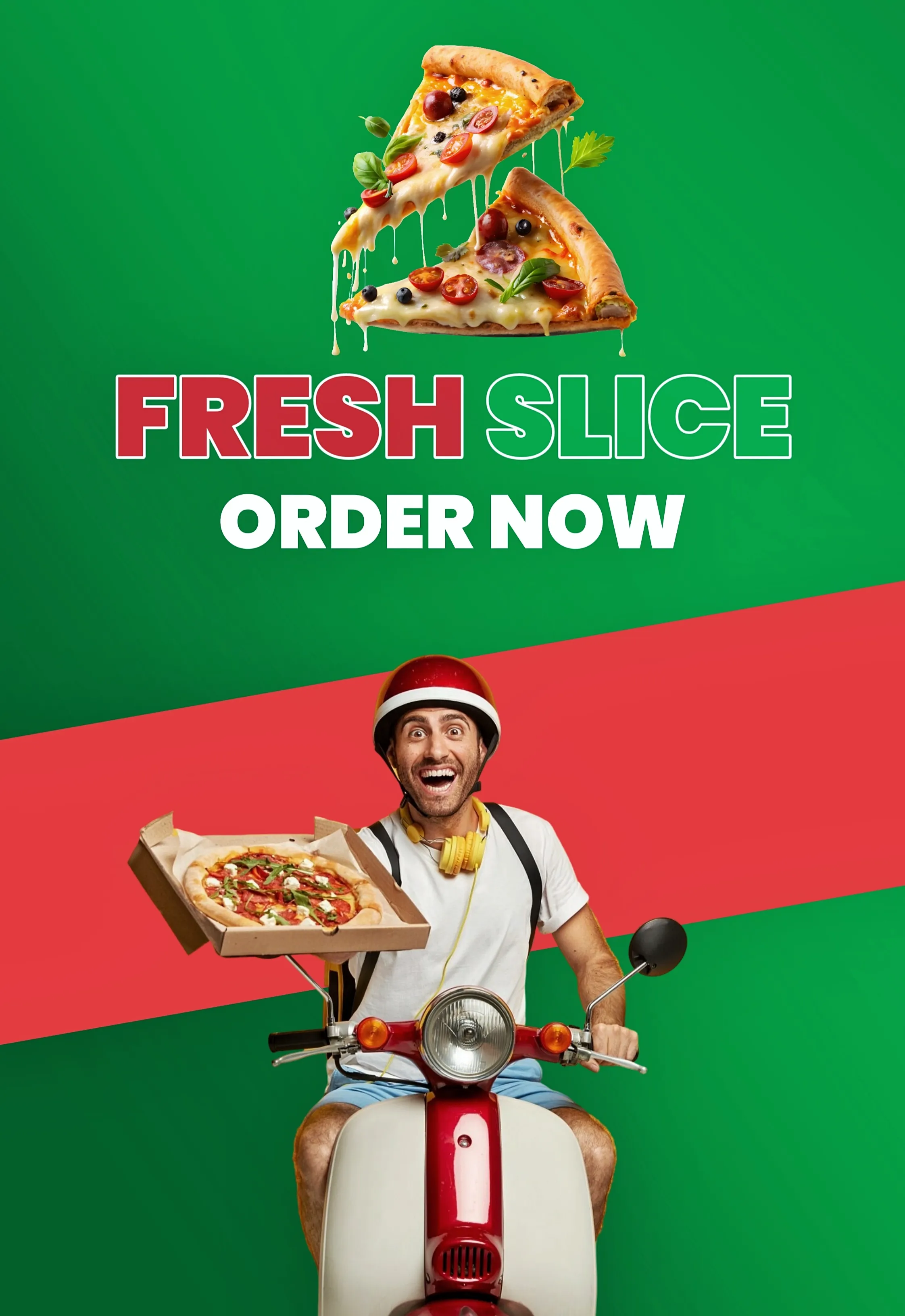
A large-format 'Fresh Slice Order Now' poster featuring a delivery-person photograph and the Freshslice logo.
Delivery poster.

The project translated one visual direction across social, print, web, and large-format applications.
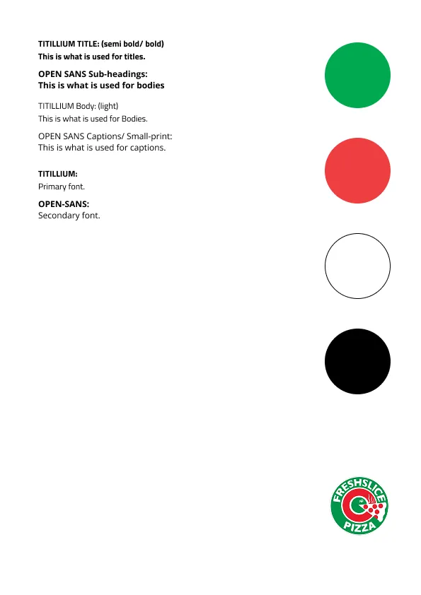
A style-guide sheet listing Titillium as the primary typeface and Open Sans as the secondary typeface, alongside Fresh Slice's green, red, white, and black brand colors and logo.
Type and color reference — Titillium for titles, Open Sans for body copy, applied within Fresh Slice's existing brand palette.

Titillium and Open Sans, and the green, red, white, and black palette shown above, are the brand’s own — the applications throughout this project were designed within that existing identity, not a new one.

Exploration
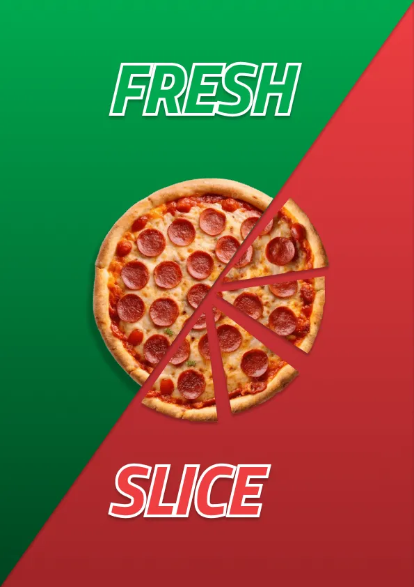
An early typographic exploration of the phrase 'Fresh / Slice Lives Here' using an outlined, stroke-only lettering treatment.
Outlined treatment.
The same 'Fresh / Slice Lives Here' phrase explored with a solid white-fill lettering treatment.
Solid-fill treatment.

Early typographic explorations tested different treatments of the campaign message.

My role on this project

  • Designed the "Fresh Slice Lives Here" campaign and extended it across social, print, web, and large-format applications
  • Explored outlined and solid-fill typographic treatments for the campaign wordmark
  • Applied Fresh Slice's existing type and color system consistently across every format

Reflection

The main challenge in Fresh Slice wasn’t inventing a new look — the brand’s own type and color system was already established — but translating one campaign idea, “Fresh Slice Lives Here,” cleanly across formats that behave nothing alike: a square Instagram post, a widescreen web banner, a bus-stop panel, a tabloid print poster. Testing the wordmark as both an outlined and a solid-fill treatment before settling on one was part of that same discipline — working out which version held up across the widest range of sizes and materials, not just the one it was designed on.

Next project

AFCA-BC