Juggle
A mobile task-and-calendar app concept for freelance designers, built as a team project for SFU's IAT 334.
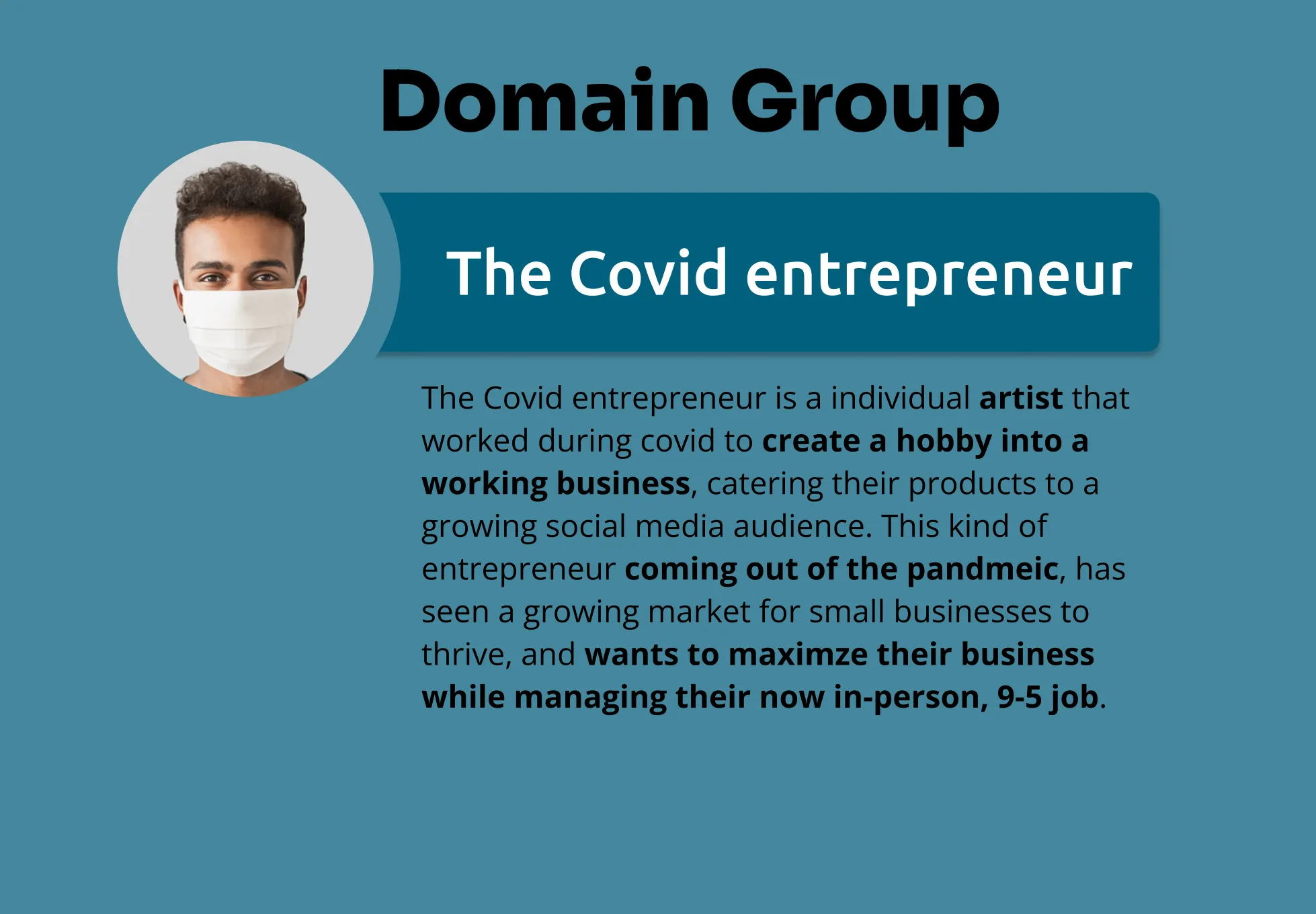
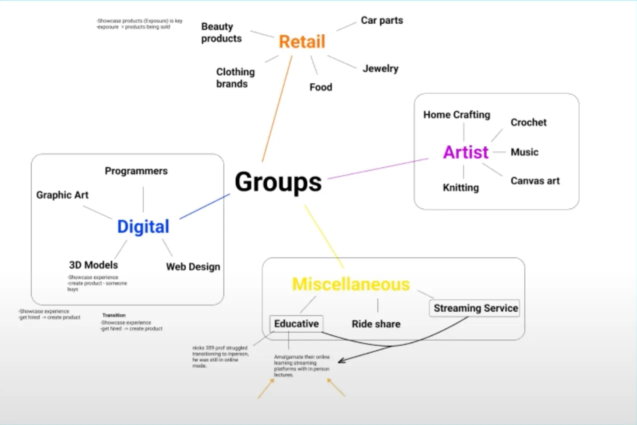
A team project for SFU’s IAT 334, Juggle was built around a specific gap its team identified: freelance designers, especially those newly navigating the pandemic-era gig economy, had project-planning tools and task tools, but nothing that connected the two in one place. The team’s own research cited LendingTree’s finding that 49% of pandemic-era hobbies had turned into small businesses, pointing at a specific kind of user: someone whose Etsy shop or side business had started at home, now needing to coexist with a return to in-person work. The app paired a to-do list with a calendar-based task system so designers could plan and execute in the same interface, without the general-purpose clutter of a broader productivity app.
Research
That focus came out of the team’s own research process: informal interviews conducted in a localized format, mostly with friends and college peers whose routines had been upended by the pandemic. From there, the team defined a persona to design around: Mischelle Livton, a UX designer who’d turned a hobby into an Etsy shop and was now trying to balance it against a day job. Her stated goals were straightforward: plan her day clearly enough to fit both halves of her work in. Her pain points were the ordinary cost of split attention: forgetting small tasks, and losing track of which parts of the day belonged to which side of her life.
Design evolution
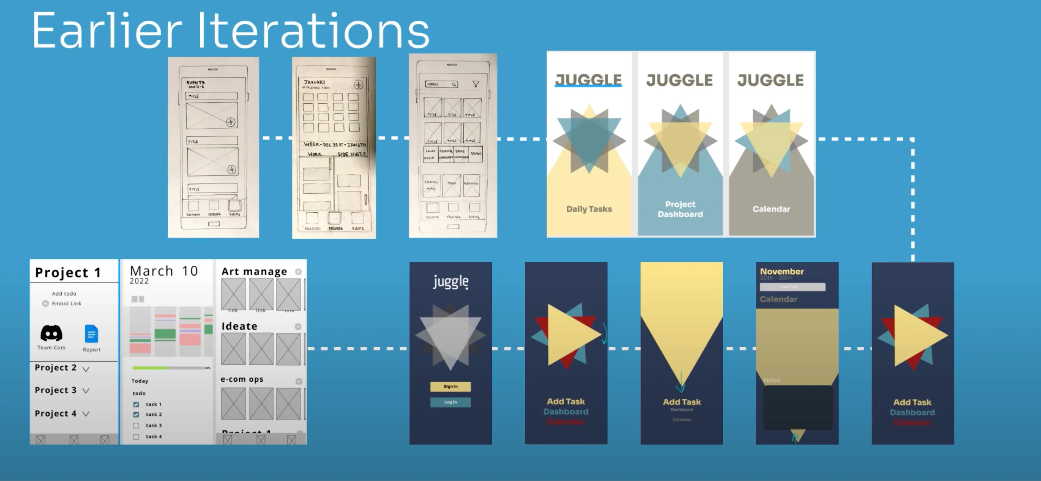
Between those early explorations and the final app, the team also pulled back on the flow itself: narrowing down to the specific interaction points a user needed to reach the app’s core features, like creating a project or checking off a task, instead of routing through extra steps in between.
What we tested
- Creating a project
- Planning tasks
- Signing up
- Opening the app to start a task
What we found
- Text that ran too small
- Contrast that was hard to read
- Copy that tested as confusing
- Interactions that gave users too little control
The one fix that made it into the final design: the triangle-based icons used to signal task urgency read fine as a concept, but tested worse in practice than a conventional scheme. The team replaced them with the red/yellow/green system shown below.
Final design
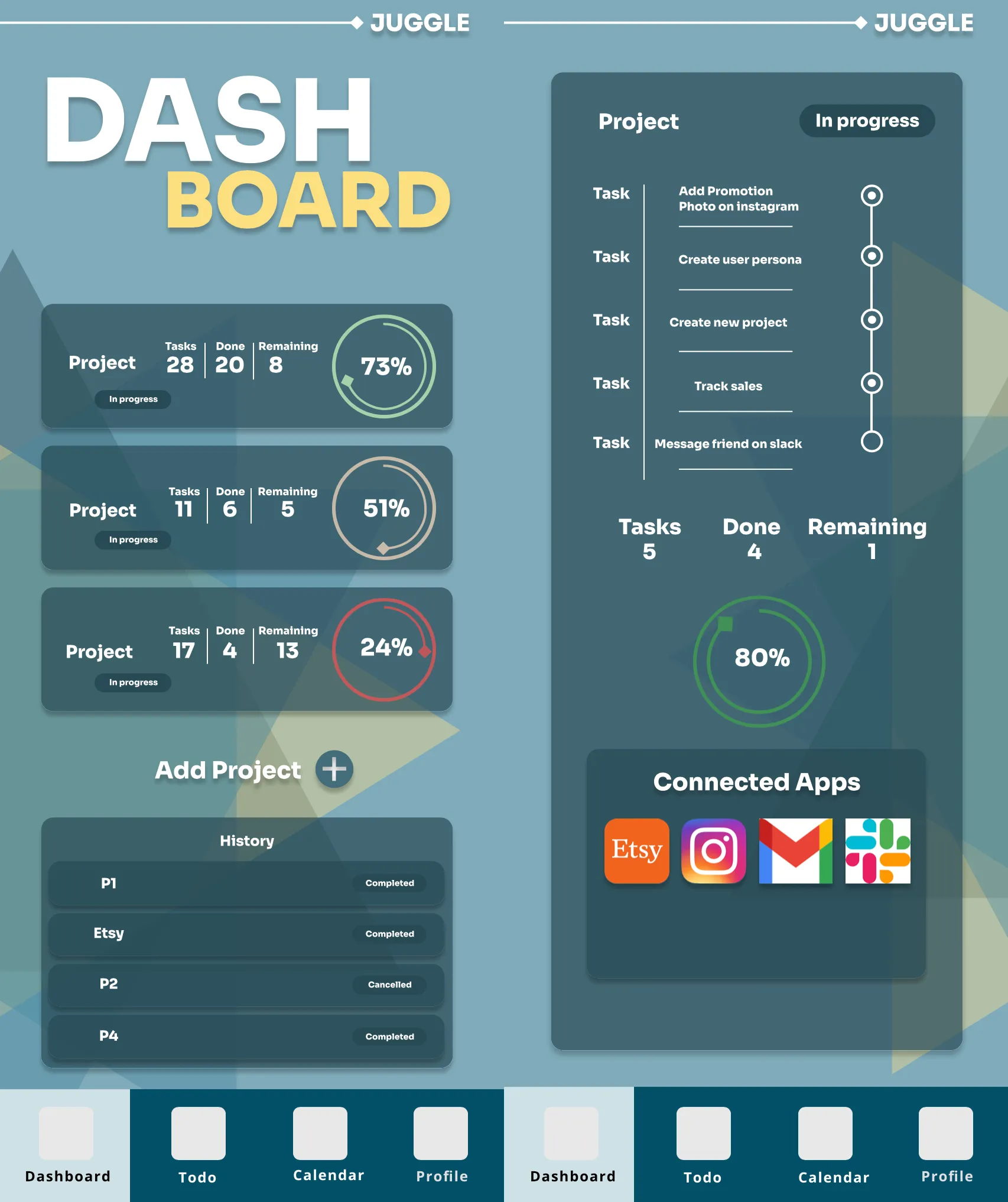
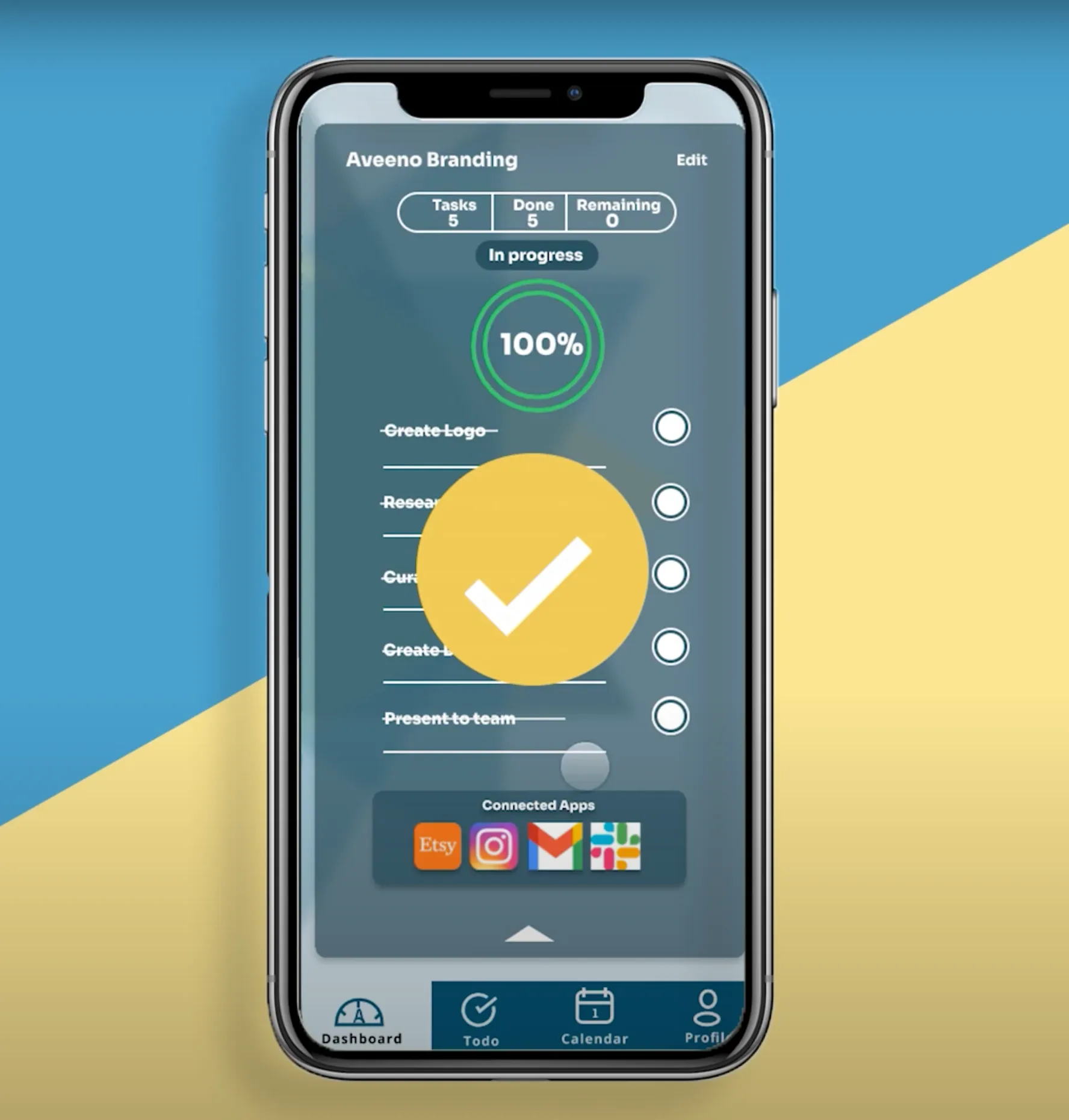
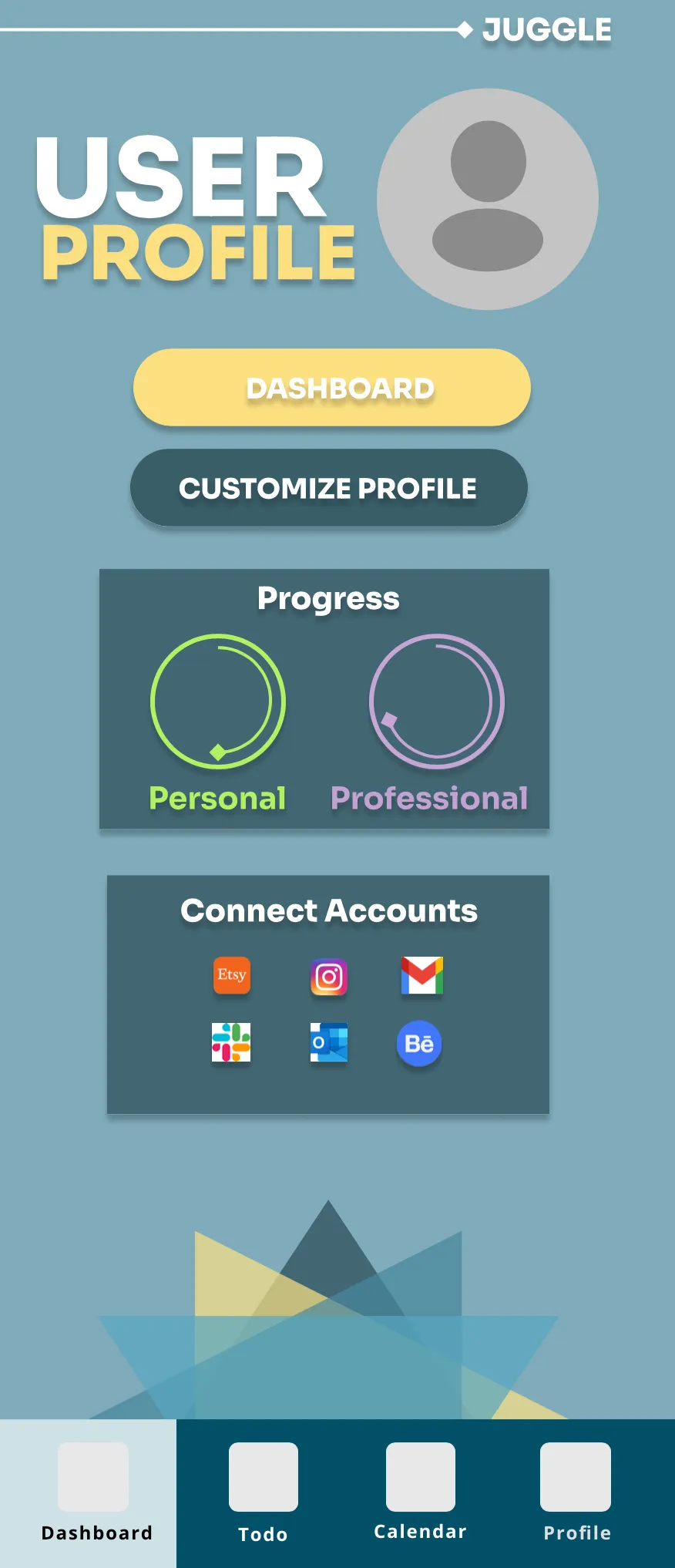
After the team’s research, flow narrowing, and usability testing, Juggle converged on a small set of core screens: a dashboard connecting the user’s projects to their relevant third-party apps, a todo list for daily tasks, and a profile that kept personal and professional progress visibly separate.
My role on this team project
- Designed and built the dashboard: project cards, completion rings, and connected third-party apps
- Designed and built the To-do section, including its task-completion animation
Reflection
The clearest lesson from Juggle came out of usability testing itself: the triangle-icon system for signaling task urgency read fine as a concept, but tested worse in practice than a more conventional red/yellow/green scheme, so the team replaced it. It was a reminder that a distinctive visual idea can lose to a familiar one when the familiar one communicates faster, useful to learn on a tool that was already asking users to trust a new pairing of to-do lists and a calendar in one place.