Course Project

Pop Art

A team academic project reimagining Textielmuseum Tilburg as a conceptual client — an interactive event microsite, built around Wolfgang Weingart's design philosophy, extended into a matching offline campaign.
Role
UI/UX Designer
Organization
Textielmuseum Tilburg (conceptual client)
Team
Team project — SFU IAT 438
Timeline
January 2023 – March 2023
Tools
Figma
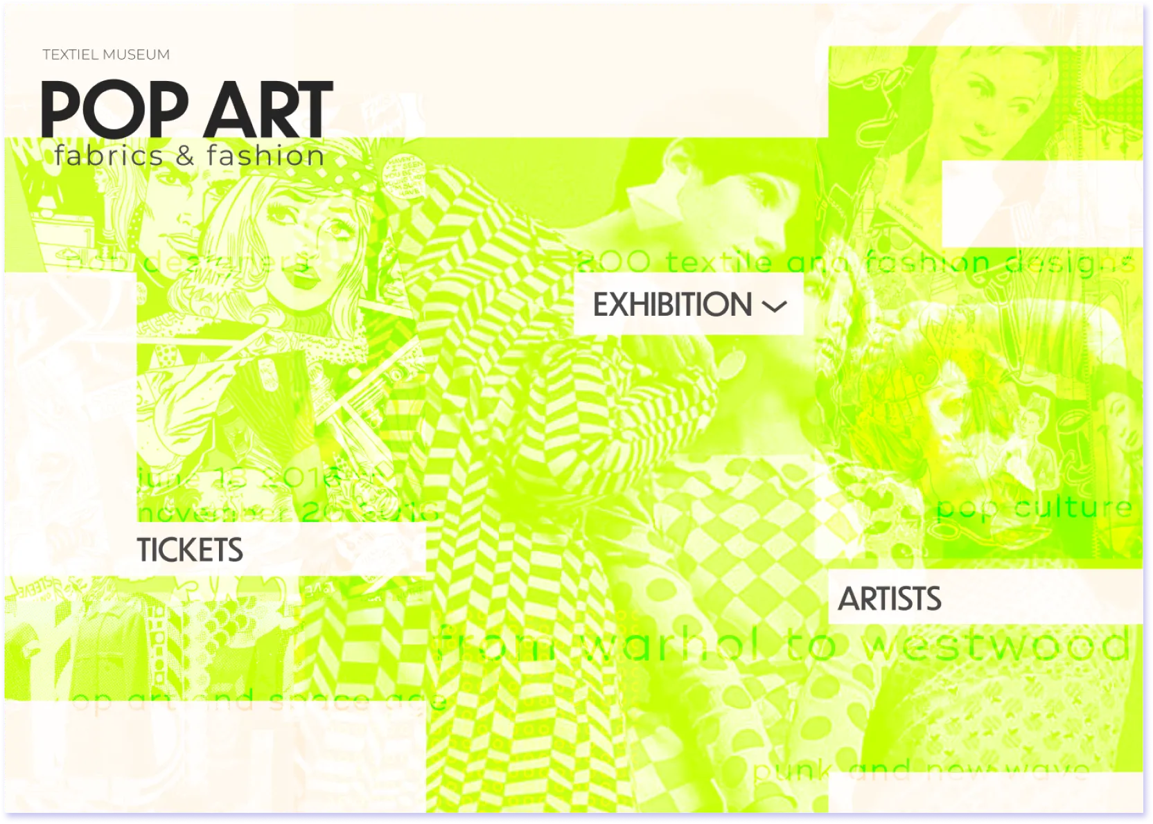
The Pop Art: Fabrics & Fashion microsite home screen — a layered neon-green collage of 1960s–70s fashion imagery over "POP ART fabrics & fashion," with Exhibition, Tickets, and Artists navigation and the line "from warhol to westwood."

Context

Team project — UI/UX Designer. Pop Art: Fabrics & Fashion was a team project for SFU’s IAT 438, built around a conceptual client: Textielmuseum Tilburg, a real textile museum in the Netherlands. The brief was to design a pre-event microsite for a fictional exhibition tracing pop culture’s fashion history “from Warhol to Westwood” — and, as the surviving material shows, the team carried that same visual language beyond the site into a matching offline campaign.

Textielmuseum was never an actual client. The brief used a real institution as the subject of a hypothetical, so the project had something concrete to research against rather than an invented museum with no real context behind it.
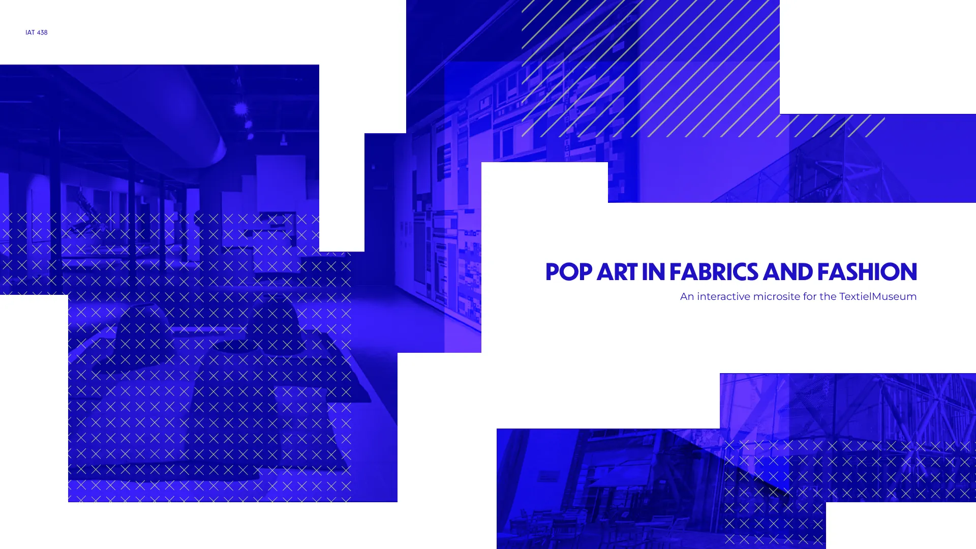
Title slide from the team's presentation deck: 'Pop Art in Fabrics and Fashion — An interactive microsite for the TextielMuseum,' course code IAT 438, over blue-toned museum interior photography.
The project's own framing, from the team's presentation deck.

Research & visual direction

The team’s research ran in two directions. On the design-precedent side, Wolfgang Weingart’s Swiss/Basel-school poster work became the project’s central reference — its use of transparency to layer imagery, and carefully placed geometric elements to guide the eye toward visual hotspots.
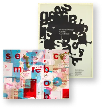
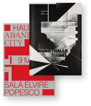
Research reference: a Graphic Design Alumni poster for ACG Basel, alongside a bright collage-style poster combining red, blue, and pink geometric fragments with typography.
Basel-school design references.
Research reference: two Kunsthalle Basel exhibition posters in the Swiss International Style — one a stark black-and-white geometric composition, the other bold red typographic blocks.
Kunsthalle Basel poster references.

On the subject-matter side, the team also worked from a real Textielmuseum-adjacent publication profiling Dutch textile and fashion designers — grounding the fictional exhibition’s program in an actual curatorial context rather than an invented one.
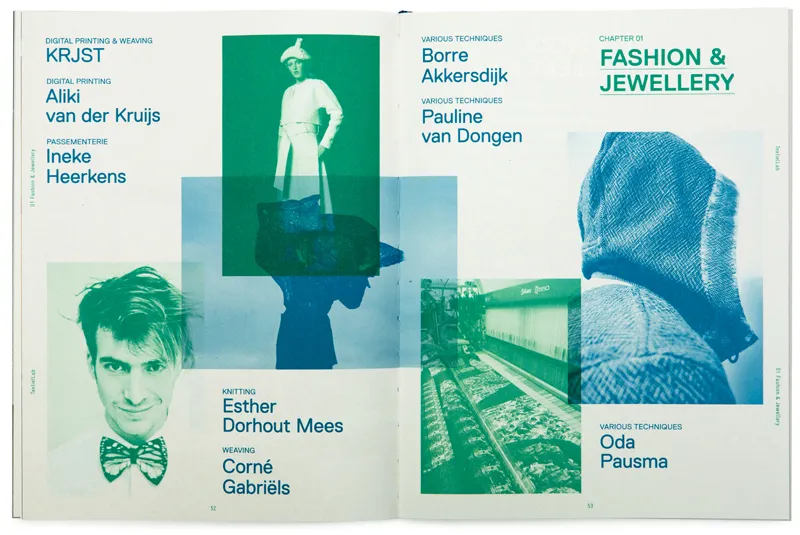
A scanned spread from a real textile-museum publication: 'Chapter 01: Fashion & Jewellery,' profiling Dutch designers Borre Akkersdijk, Pauline van Dongen, Esther Dorhout Mees, Corné Gabriëls, and Oda Pausma, with photographs of their work.
A real museum publication used as subject-matter research.

Developing the visual language

Typography

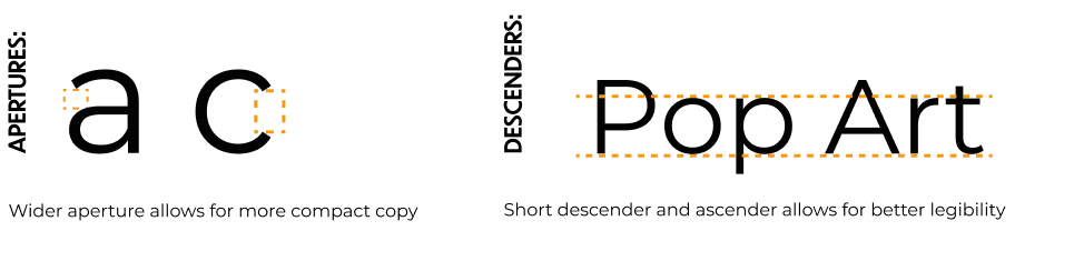
Two typefaces carried the system: Dunbar Tall for headlines, chosen for its extended, condensed letterforms and retro character, and Montserrat for body copy, for its clean, readable sans-serif lines. An alternative headline face, Bao Pro Bold, was compared against Dunbar Tall on terminal shape and x-height before being set aside.
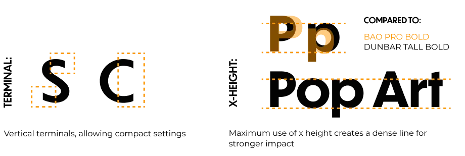
Typography rationale slide comparing letterform terminals ('S', 'C') and comparing Dunbar Tall Bold's x-height against an alternative, Bao Pro Bold, in the word 'Pop Art.'
Comparing Dunbar Tall against a rejected alternative, Bao Pro Bold.
Typography rationale slide on letter apertures ('a', 'c') and descenders, illustrated with the word 'Pop Art.'
Aperture and descender rationale for the final headline face.
Final typeface pairing: Dunbar Tall Medium for headlines and Montserrat Regular for body copy, shown against the exhibition's real description copy — 'The exhibition Pop Art Fabrics & Fashion displays more than 200 textile and fashion designs, from the birth of pop culture in 1956 to its turbulent demise in the 1970s.'
The final pairing, set against the exhibition's own description copy.

Posters

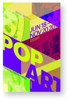
Layout and color were explored in parallel — the same “Pop Art Fabrics and Fashion” content, tried across five distinct color and grid treatments before the team settled on the boxy, collaged look that carried through to the finished posters.
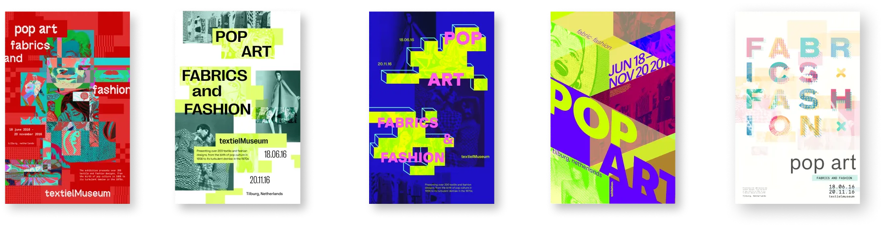
Five poster layout and color explorations for 'Pop Art Fabrics and Fashion': red, teal-and-white, blue-and-magenta diagonal, yellow-and-purple diagonal, and a white pastel typographic version.
Five color and layout variants explored before finalizing the poster system.

Designing the experience

The prototype wasn’t a single screen — the team mapped and built out three distinct structures, each documented as its own flow.

Ticket purchase

From the homepage’s Tickets link, the flow moves through a shopping-cart-style tickets panel, a billing-details form, and a confirmation screen with an order number and a barcode-style ticket — built out as a full checkout, not a simplified stand-in for one.
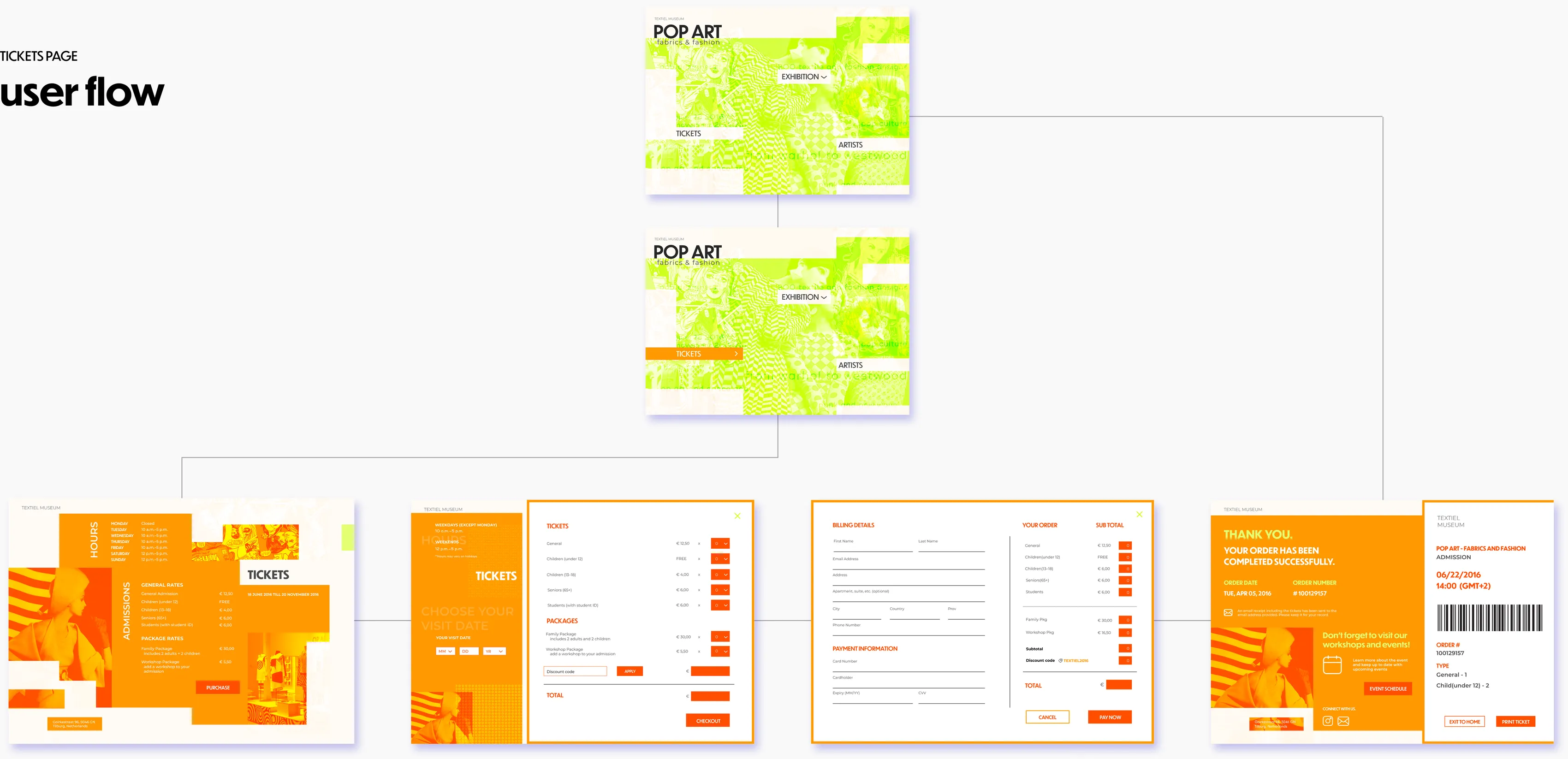
Tickets page user-flow diagram: from the homepage through a tickets selection panel, billing details and payment form, to a 'thank you' confirmation screen with a barcoded ticket.
The ticket-purchase flow: selection, billing, payment, confirmation.

Home, About & Calendar

The main navigation connects the homepage to an About panel — labeled “Behind the Runway” in the prototype, with the exhibition’s itinerary and museum contact details — and to a calendar of exhibition dates, filterable by artist.
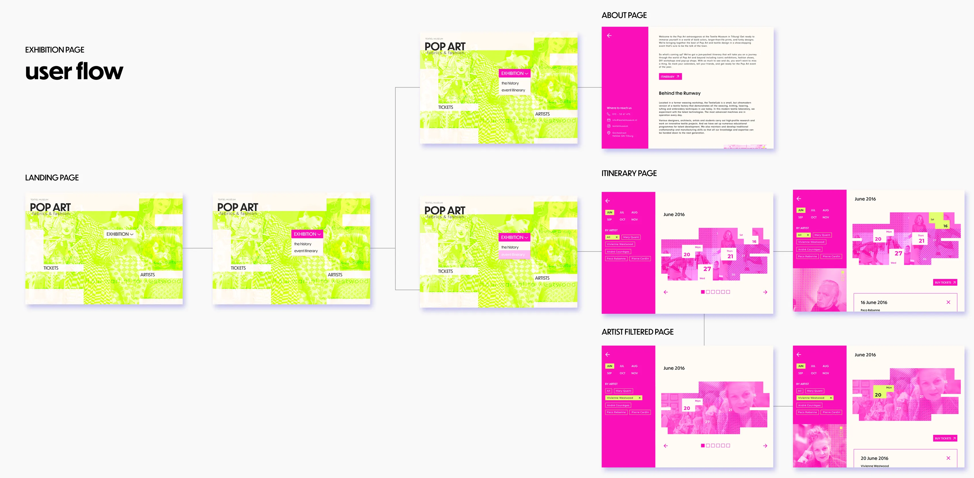
Home, About, and Calendar user-flow diagram: the homepage linking to a 'Behind the Runway' about panel and to a pink calendar view, filterable by artist, with individual dated event cards.
The main navigation: home, about ('Behind the Runway'), and the filterable exhibition calendar.

Artists

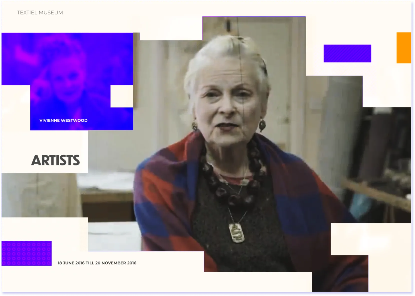
From an Artists list, at least one full profile — Vivienne Westwood — expands into dedicated Haute Couture and Punk + New Wave sub-pages, incorporating archival interview footage of Westwood herself.
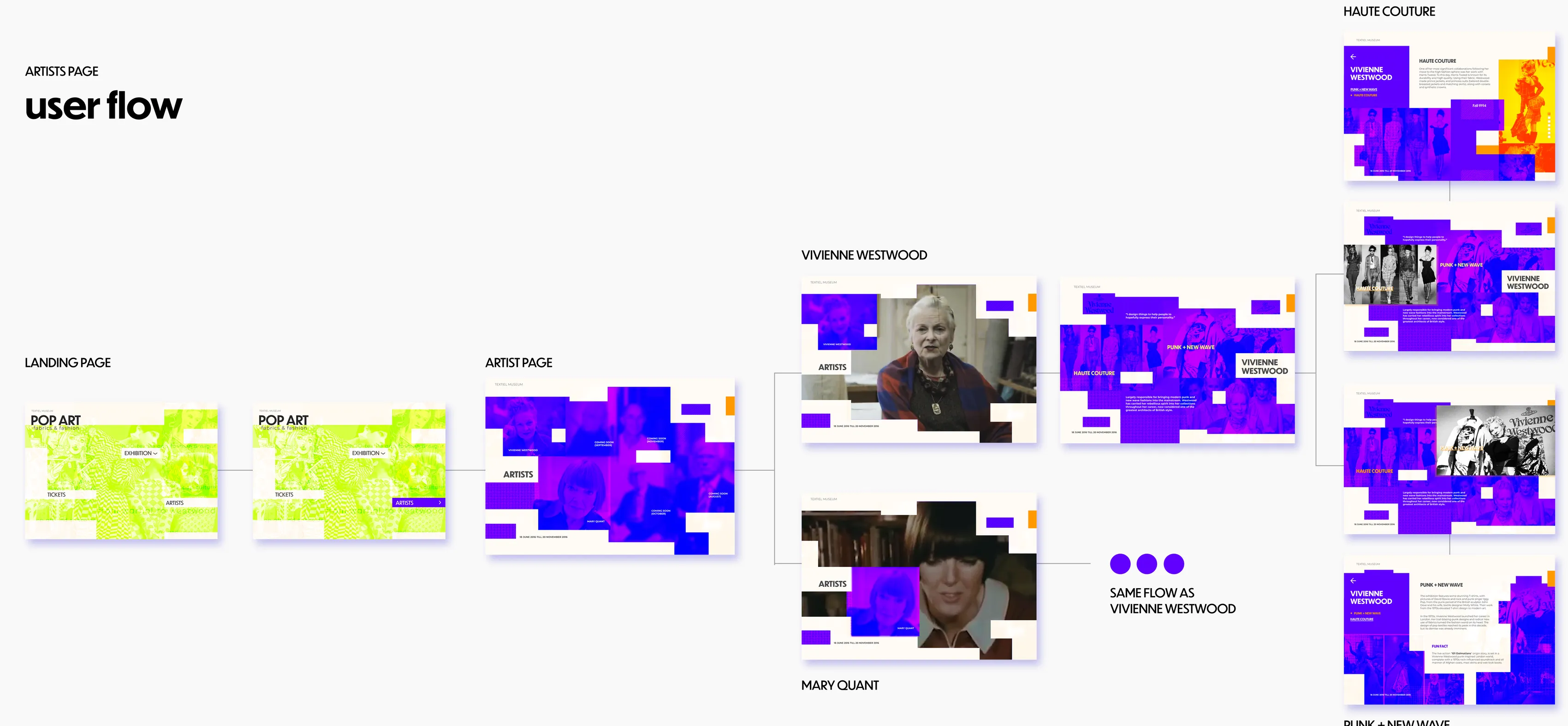
Artists section user-flow diagram: from an artists list to a Vivienne Westwood profile page, expanding into Haute Couture and Punk + New Wave sub-pages with archival photography and video stills.
The Artists flow, expanding into a Vivienne Westwood profile.

Final microsite

The finished screens read as one interface system rather than a set of disconnected pages — the same collaged photography, the same “POP ART fabrics & fashion” wordmark, and the same Gestalt-driven layout logic carried across the homepage, the exhibition itinerary, the ticket-purchase screens, and individual artist profiles.
The microsite home screen: a layered neon-green collage of 1960s–70s fashion imagery, the 'POP ART fabrics & fashion' wordmark, and Exhibition, Tickets, and Artists navigation.
Home.
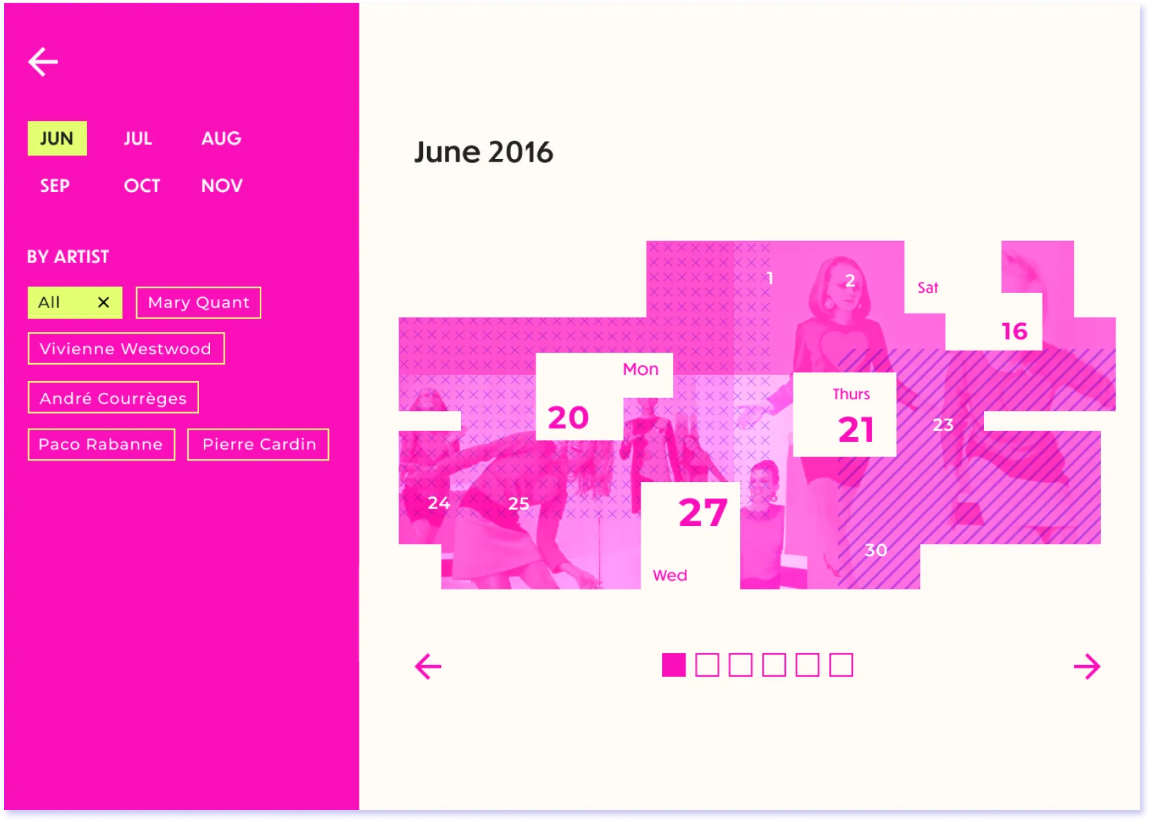
Exhibition calendar screen in magenta: a June 2016 date grid overlaid with fashion photography, filterable by artist (Mary Quant, Vivienne Westwood, André Courrèges, Paco Rabanne, Pierre Cardin).
Exhibition calendar, filterable by artist.
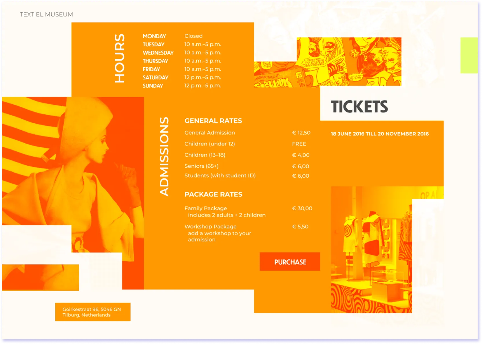
Ticket-info screen in orange: museum hours, general and package admission rates, exhibition dates, and the Textiel Museum's Tilburg address.
Tickets — hours, pricing, and museum address.
Vivienne Westwood artist profile screen in blue-violet, featuring archival interview video of Westwood, her name, and Haute Couture / Punk + New Wave section tags.
An individual artist profile, with archival interview footage.

One thing visible directly in the screens, though never stated as a formal rule in the source material: each section of the site uses its own neon monochrome hue — lime for Home and the exhibition overview, magenta for the calendar, orange for ticketing, blue-violet for artist profiles.

Home / Exhibition#A4FF04
Calendar#FB0FBB
Tickets#FF9900
Artists#5200FE

Beyond the screen

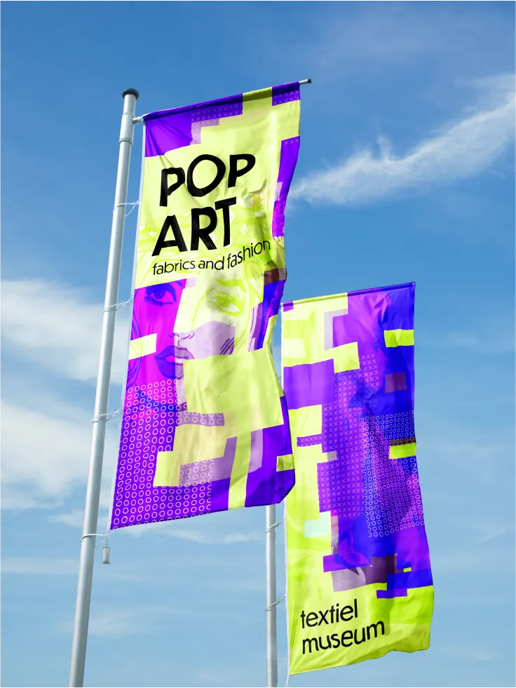
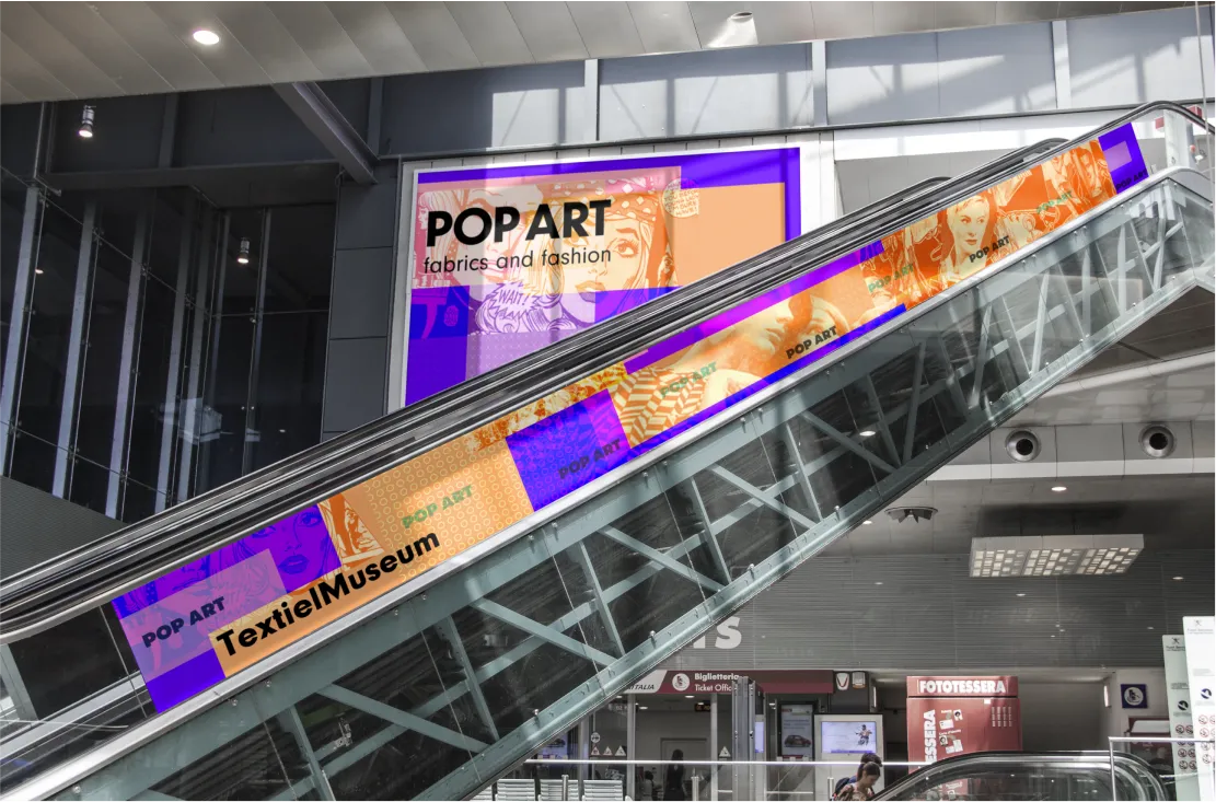
The visual direction didn’t stay on screen. The same wordmark and palette were mocked up across real out-of-home formats — a transit shelter, a building-mounted banner, flags, and a mall escalator takeover — extending the microsite’s identity into a full campaign.
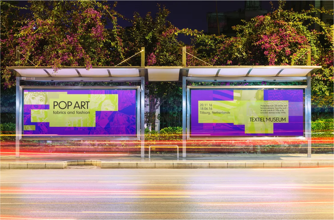
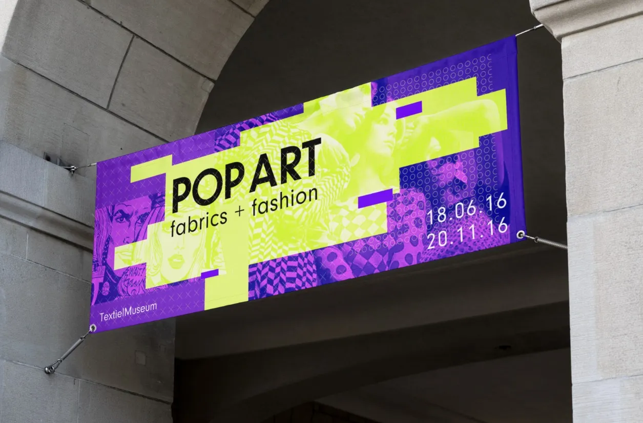
Photo-realistic mockup of a lit bus-stop shelter at night, with two 'Pop Art fabrics and fashion' Textiel Museum ad panels, long-exposure light trails from passing traffic.
Bus-shelter advertising, mocked up in a real environmental photo.
Photo-realistic mockup of a 'Pop Art fabrics + fashion' banner hung beneath a stone archway.
Building banner.
Photo-realistic mockup of two 'Pop Art fabrics and fashion / textiel museum' flags against a blue sky.
Flags.
Photo-realistic mockup of a mall escalator wrapped in 'Pop Art' branding, beneath a matching wall billboard.
Escalator and billboard takeover.

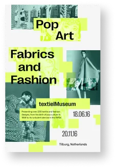
The poster itself went through several finished colorways rather than a single fixed design.
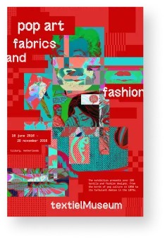
Finished 'pop art fabrics and fashion' poster in red, with a collaged comic-and-photography treatment.
Red colorway.
Finished 'Pop Art Fabrics and Fashion' poster in teal and white, with duotone fashion photography.
Teal colorway.
Finished 'POP ART FABRICS & FASHION' poster in blue and magenta, with a diagonal grid composition.
Diagonal blue/magenta colorway.

My role on this team project

  • Applied design theory inspired by Wolfgang Weingart to create layered, dynamic UI visuals for the microsite
  • Coordinated sprint-based design reviews and critiques to align the team on creative direction
  • Built and presented the Figma-based site prototype

Reflection

This was one of the more formative projects early in my design education. It’s where typography stopped being an abstract choice and became something I could reason about at a granular level — spacing, terminal shapes, x-height — and where grids started to read as the invisible structure holding a layout together, rather than something applied after the fact. Adapting a historic reference like pop art into a working digital interface, through posters, font-pairing tests, and iteration, shaped how I still think about grid structure, color, and copy today.

Next project

Emendavimus