SFU Kendo
An ongoing visual identity and communication-design role for SFU's student-led kendo club, a new mark and wordmark applied across posters, apparel, and social media.
- Contribution
- Visual identity, logo/mark, promotional graphics, posters, social assets, and apparel design.
- Production
- Physical apparel and print materials produced by Team Litzen.

Context
SFU Kendo is a student-led club rooted in Japanese tradition, and its visual identity didn’t reflect either half of that: nothing tied its heritage to its affiliation with the university. The original logo was hard to reproduce consistently across mediums and didn’t carry much symbolic weight. What the club needed was a mark that could hold up as a versatile emblem across posters, apparel, and digital promotions, something current members and prospective newcomers would both recognize.
Exploration
The mark’s construction drew on two research threads: SFU’s own brand guidelines (its official red and white palette, used to keep the club visually consistent with other student organizations) and the visual conventions of martial-arts and samurai iconography, focusing on symmetry, clarity at small sizes, and recognizable kendo gear: the men (helmet), dō (chest armor), and shinai (bamboo swords). Club members also weighed in on the values they wanted the mark to represent: discipline, respect, and cultural authenticity.
Shape
The men’s silhouette went through several rounds of line construction before its proportions were narrowed toward the final mark.


Color and fill
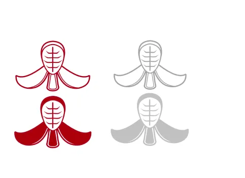
Before the palette was settled, the same core shape was tested as an outline and as a solid fill, in red and in a neutral gray.
Lockup
Before / After

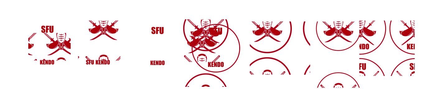
The new mark replaces that with a bold circular emblem: a frontal view of the men and dō, framed by two crossing shinai. The symmetrical layout evokes balance and formality, core to both kendo and samurai aesthetics, while red and white reinforce SFU’s own branding and Canadian identity. It’s built minimal enough to reproduce cleanly across uniforms, posters, and digital media.
Identity system

Applications
The identity has been implemented across event posters and digital banners, club social media, and custom apparel, worn at tournaments and intercollegiate events and used for recruitment during SFU Clubs Days.
Posters
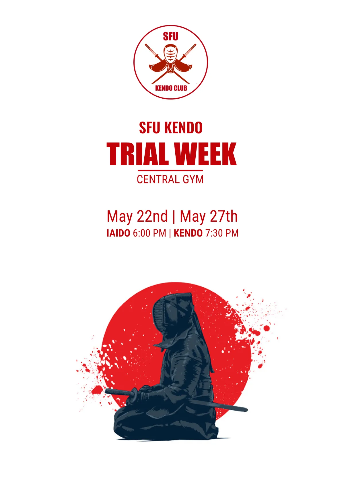
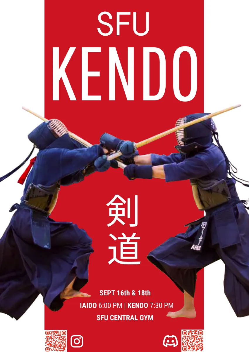
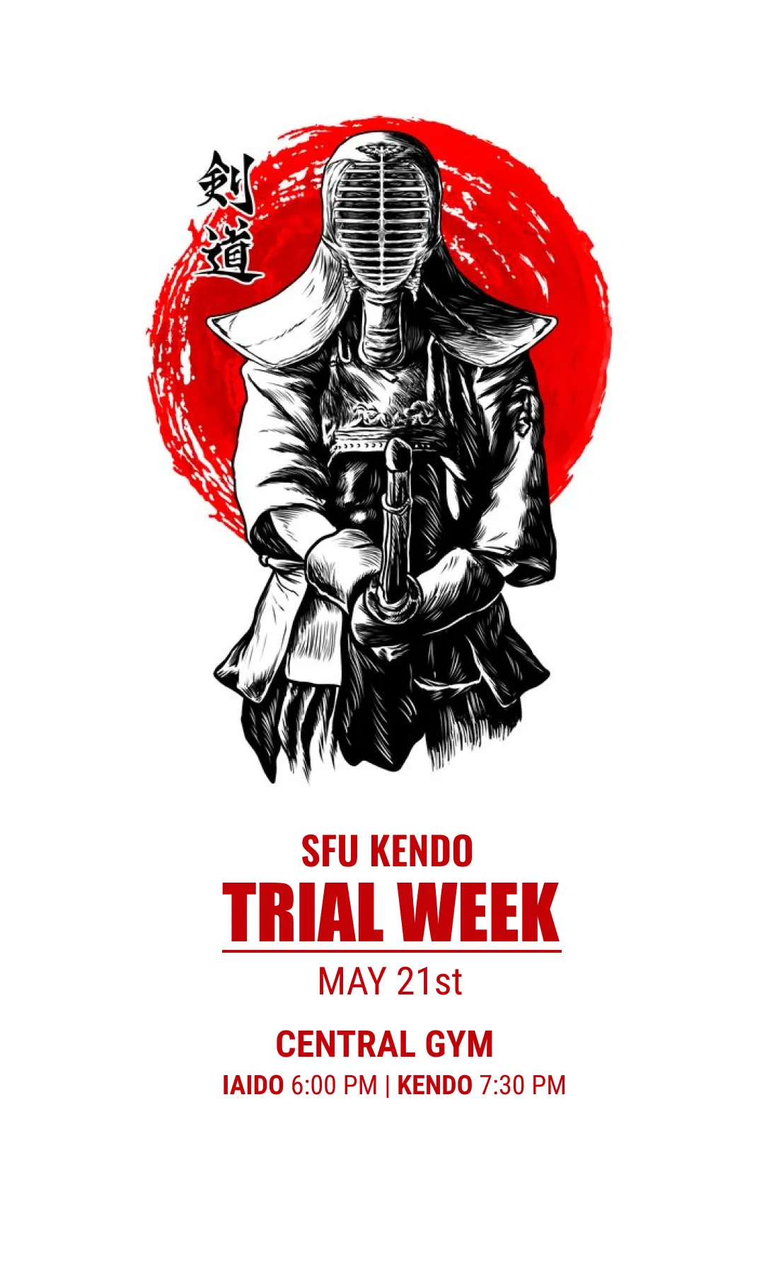
The club’s recruitment posters take different visual approaches (photographic, illustrated, graphic) rather than a single fixed template.
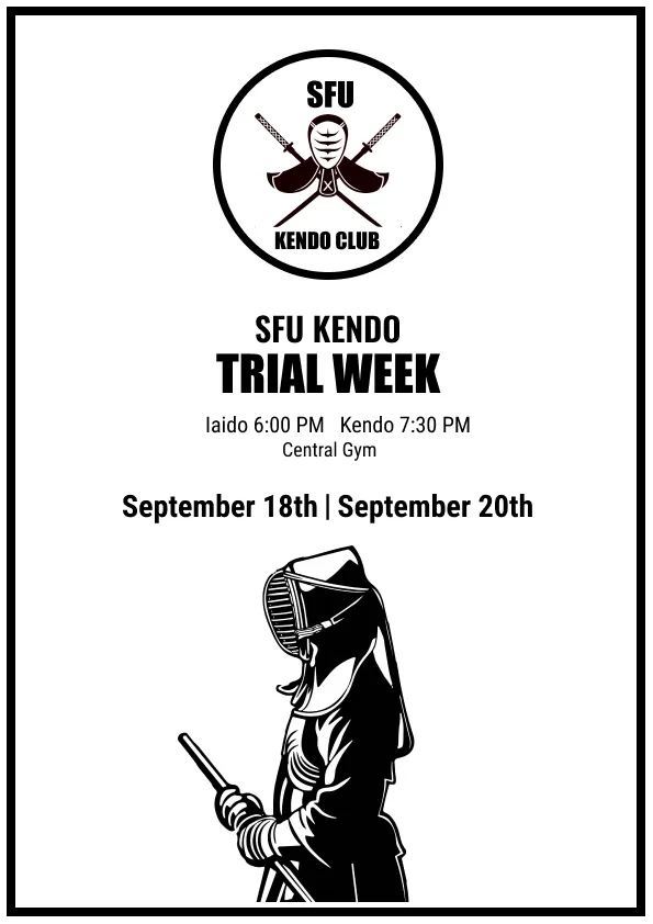
Social
The same ink-illustration campaign carried onto Instagram, reformatted for a Story’s taller canvas rather than a printed page.
Apparel
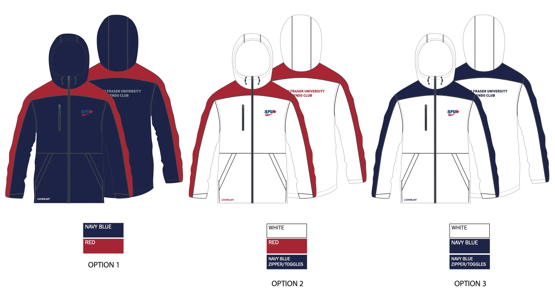
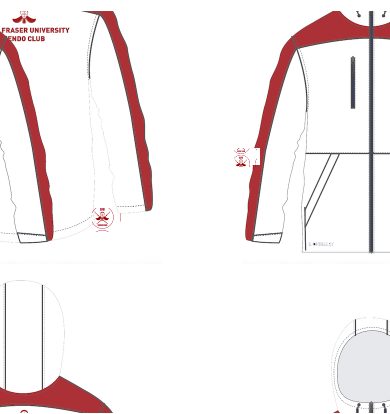
The red-and-white colorway was the one produced.
In practice
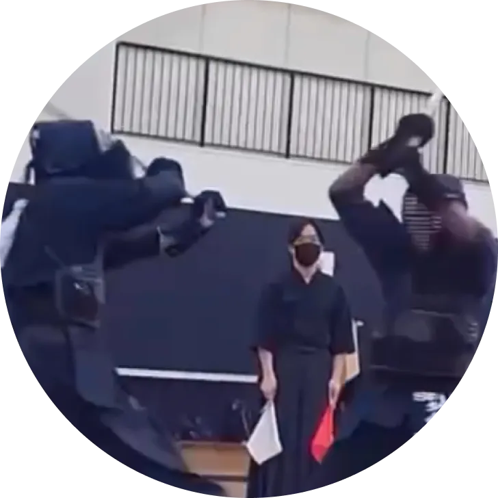
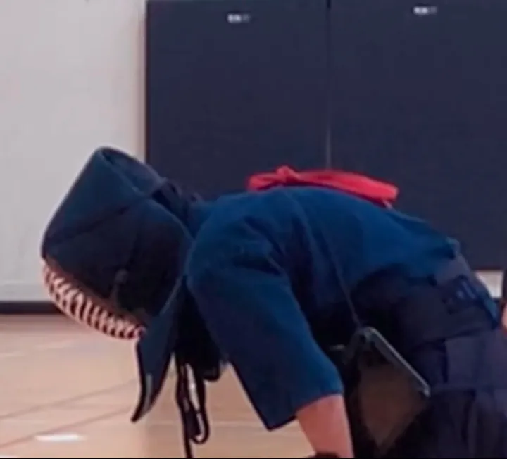
Beyond the mark and its applications, the identity exists inside a real, ongoing club: training sessions, tournaments, intercollegiate events.
My role on this project
- Designed the club’s visual identity: the mark, wordmark, and color system
- Created promotional graphics: posters, social assets, and digital banners
- Designed the apparel colorways, produced by Team Litzen
Reflection
The apparel is what I’d point to as the clearest success. It shows up at tournaments and intercollegiate events, and it’s done more for member pride and a unified club image than anything else in the system. Working on this deepened how I think about cultural heritage and modern branding together, and about building an identity system that’s functional and versatile without losing the emotional weight a community actually needs from it, all while working inside SFU’s own institutional guidelines rather than around them. The process itself was iterative: design passes, direct feedback from members, and constant checks against brand consistency. That’s a habit I still carry into identity work for other organizations.